Score
Bloodhound Cafe Branding by Johanna Szpetun
The branding project for Bloodhound Cafe by Johanna Szpetun emphasizes the importance of a cohesive identity system that reflects the core concept of 'human fuel.' By utilizing a simple yet effective design approach, including a distinctive lightning bolt symbol and a warm color palette, the branding demonstrates how minimalism and restraint can create a powerful and recognizable brand identity.
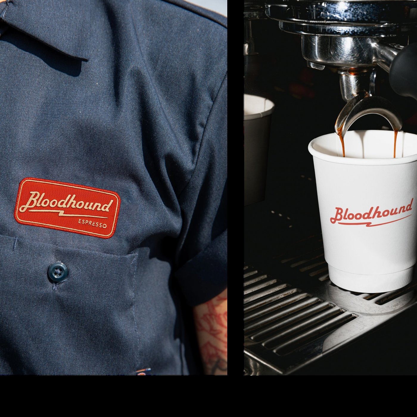
Abduzeedo: Bloodhound Cafe Branding by Johanna Szpetun jeff May 04, 2026 Bloodhound is a cafe branding project by Johanna Szpetun for a Darlinghurst venue built around the concept of human fuel. The identity uses a lightning bolt symbol over warm amber and dark brown tones. Distressed textures and vintage repair shop details keep the system from feeling too clean. Menu designs pair hand-drawn illustrations with condensed serif type. The full cafe branding collateral from printed menus to cup sleeves shares the same warm hand. Custom patterns on the takeaway cups extend the system further into three dimensions.
The details of the cafe branding One mark, one palette, two type families. The lightning bolt reads as energy without being literal about coffee or fuel. The distressed overlay on the illustrations keeps everything from looking too produced. This cafe branding work shows how a simple concept carries a full identity system. Every cafe branding element from signage to packaging carries the same DNA. The approach proves restraint works better than adding noise.
While the project showcases effective branding strategies, it is focused on a single cafe rather than a larger industry shift, making its overall impact moderate, and the concepts discussed are somewhat standard in the design field, though the emphasis on minimalism is relevant for brand strategy professionals.