Score
Meet the designer behind NYC’s charming World Cup campaign
The World Cup campaign designed by Arsh Raziuddin for New York City emphasizes community engagement and inclusivity, using vibrant visuals and local symbols to foster excitement among residents and tourists alike. This strategic approach highlights the importance of aligning brand identity with the city's unique character, showcasing how effective design can transform perceptions and enhance public participation in major events.
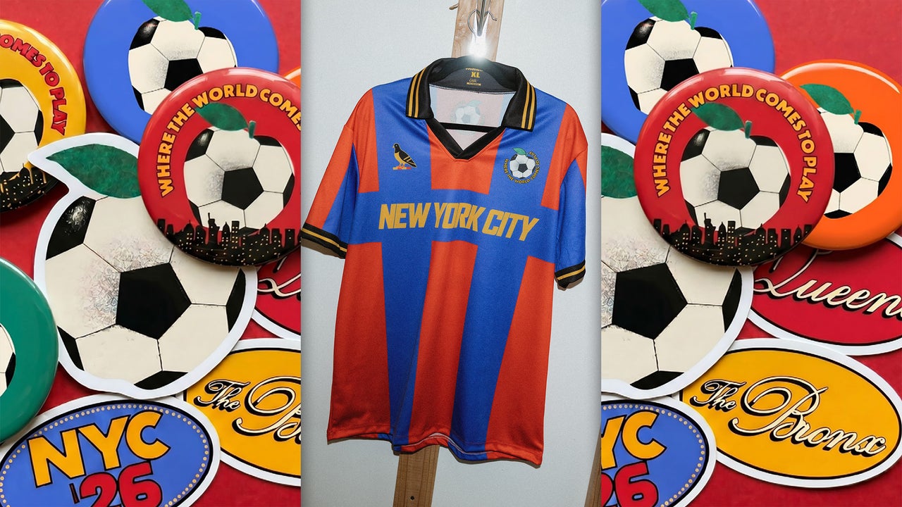
FastCompany: How do you build excitement among 8.5 million New Yorkers (and 1.2 million tourists) for the World Cup? You start with deep research on the city’s beloved colors and symbols and then turn that into something like the joyful, nostalgic, and vividly hued bus shelter posters, subway signs, souvenir cups , and jerseys the 34-year-old creative director Arsh Raziuddin designed for the citywide tourism campaign that the Mayor’s Office launched this week. “There’s an energy that we wanted to capture and I think it’s matching New York as of right now in a way that feels really nice,” she says.
[Image: courtesy NYC Office of the Mayor] Since running for mayor of New York City, Zohran Mamdani has become a design icon for breaking the rules of political aesthetics, from his campaign poster and branding inspired by Bollywood posters and MetroCards to his charming and affable videos . Now that he’s in office, he’s applying his refreshing approach to visual communication on an even grander scale. The World Cup campaign is his biggest yet. What’s notable about the strategy is how it applies all the feel-good parts of sports fandom to New York itself.
While mega-events like the Olympics and the World Cup are touted as major economic drivers for host cities, the reality is usually more modest . Instead of benefiting FIFA or being in service of this summer’s tournament, the campaign—and the initiatives related to it , like free public watch parties, partnerships with family-owned restaurants, and public space improvements— advances the administration’s desire to make New York more inclusive and serves as a model for how other cities might conceive of mega-event branding. “The World Cup is one of those rare moments when a city gets to see itself differently,” Raziuddin says.
“Millions of people will be looking at New York, but New Yorkers will also be looking at New York. It’s a chance to celebrate the city and the communities that make it what it is.” In April, the Mayor’s Office hired Raziuddin—who is best known for masterminding the cover of Salman Rushdie’s 2019 book The Knife and her editorial design work at The Atlantic , The New York Times , and literary journal Acacia —to develop a visual identity for the campaign. It builds off a slogan of “Where the World Comes to Play,” which NYC Tourism + Conventions launched last fall . “It was two months of just insane effort,” Raziuddin says of the project.
“I had to use all the juice I had to figure out the most ‘Mayor Mamdani New York’ collab I could think of.” Importantly, she adds, it speaks about the city rather than to the city. We talked to Raziuddin about how she did it. This interview has been edited and condensed. Tell us about how you began to conceive of the visual identity. The administration has a particular look and feel. Mayor Mamdani is a part of this legacy of people who care about how design plays a role in New York. It is a great feeling as an artist, as a designer, to be around leadership that cares about communication design.
It’s often overlooked, and it really can help set up a city in a way that feels enlightening and inspirational. The brilliance of this administration in City Hall is that they don’t overdesign. They make things clear, readable, and legible. There is something unique about the energy of City Hall and of the Mayor of New York right now. I balanced my style of being very scrappy, cutout, photography, collage with the look of the Mayor’s Office that is very vector forward. [Image: courtesy NYC Office of the Mayor] What message needed to be clear through the campaign? We wanted it to speak to everyone. We wanted a child to understand what it was.
Article truncated for readability. Read the full piece →
The article discusses a significant campaign for a major global event, showcasing innovative design strategies that are highly relevant to brand strategy professionals focused on community engagement.
Weekly digest
Get the Signal digest
Every Monday morning — the top 3 brand trends, 10 high-signal articles, and one emerging signal to watch.
No spam. Unsubscribe anytime.