Score
Vandal Co.: Santiago Valencia’s Disruptive Brand Identity
Vandal Co.'s brand strategy emphasizes a disruptive and confrontational identity that challenges traditional design norms. By consistently applying a bold visual language and operating principles across all touchpoints, the brand establishes a strong, recognizable presence that resonates with its audience and reinforces its core message of breaking free from conventional constraints.
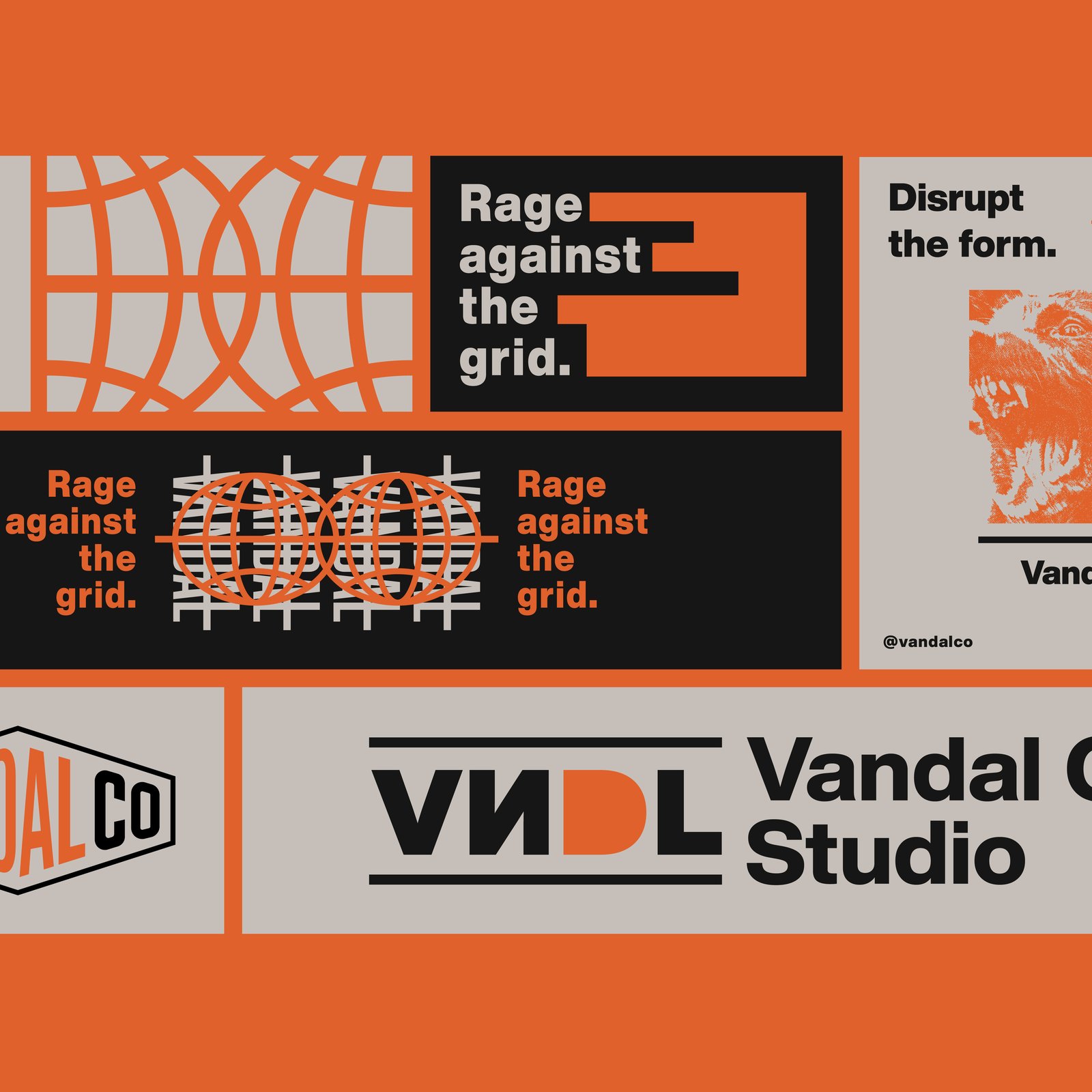
Abduzeedo: Vandal Co.: Santiago Valencia’s Disruptive Brand Identity sofia April 07, 2026 Vandal Co. is Santiago Valencia’s brand identity studio from Colombia: electric orange, raw black, and type that refuses to stay inside any grid or rule. Santiago Valencia launched Vandal Co. from Colombia’s Coffee Axis with a clear statement: design is not decoration. The studio’s brand identity system is built on confrontation. Three phrases repeat across every surface: “Disrupt the form,” “Rage against the grid,” and “Tear the grid.” These are operating principles, not taglines. The visual language centers on electric orange and raw black against off-white.
A custom diamond-badge logomark carries the “VANDAL Co.” name with sharp, compressed letterforms. The wordmark variant strips it to “VNDL” with high-contrast negative space. Both marks read clearly from a distance. Brand Identity Design That Treats Every Surface as a Statement Valencia applies the brand identity design system consistently across every touchpoint. Billboard mockups show three-column poster layouts where typography stacks at competing angles, deliberately fighting for dominance. A tote bag reads “Break the uniform” in circular type. A backlit city pillar ad says “No filter. Just disclaimer” in block sans-serif.
The studio website uses the same orange-black system with “No straight thinking” as the hero headline. A social media grid shows the full brand identity design in context: orange panels alternate with black, each holding a fragment of copy or a geometric mark. The grid-as-anti-grid idea is the whole point. The work is self-referential without being ironic. Valencia operates as a freelance designer offering branding, illustration, and lettering through his Behance portfolio . Vandal Co. earns attention through relentless consistency. Every piece reinforces the same stance.
The article discusses a significant shift in brand identity strategy that challenges traditional norms, which is impactful and relevant for brand strategy professionals, while also presenting a relatively novel approach in the design industry.