Score
Desert Kid Coffee Brings The Wild Beauty Of The Coachella Valley To Life Through A Lovingly Rooted Brand Identity
Desert Kid Coffee's brand strategy is deeply rooted in the unique landscape of the Coachella Valley, reflecting a commitment to authenticity and local culture. By creating a cohesive visual and verbal identity that draws inspiration from their childhood experiences and the natural beauty of the area, the founders aim to establish a café that resonates with both locals and visitors, marking a cultural shift in the region.
Creative Boom: News Branding Desert Kid Coffee brings the wild beauty of the Coachella Valley to life Childhood friends Katie Reed and Joseph Eccles grew up roaming the dunes and mountain trails of the Coachella Valley. After a brief stint away, they've come home to open a café with a brand identity that pays tribute to the landscape that shaped them. Written By: Katy Cowan 8 April 2026 I've never been to the Coachella Valley myself, but I've heard great things. About the light, mostly. And how it hits the mountains at dusk, transforming the sky into a deep, dusty violet.
You can understand why that sort of natural beauty gets under your skin, especially if you grew up there. Katie Reed and Joseph Eccles have roots there. They spent their childhoods exploring the dunes and mountain trails before inevitably heading out into the wider world: Katie into tech, Joseph into education. When they came back, they wanted to build something that honoured what they'd always loved about the place they called home. The result is Desert Kid Coffee, a new café and roastery opening in Palm Desert this week.
More than a coffee shop, it's a love letter to the landscape they call home — one that finds a clear echo in a full visual identity by New York studio The Working Assembly. The brief, as founder Jolene Delisle describes it, was simple: use the desert as the source for everything. "The desert already has such a powerful visual language — the colours, the light, the shapes of the mountains," she says. But rather than borrow the visual shorthand of European café culture or a generic urban coffee aesthetic, she set out to build something that could only have come from this particular patch of Southern California.
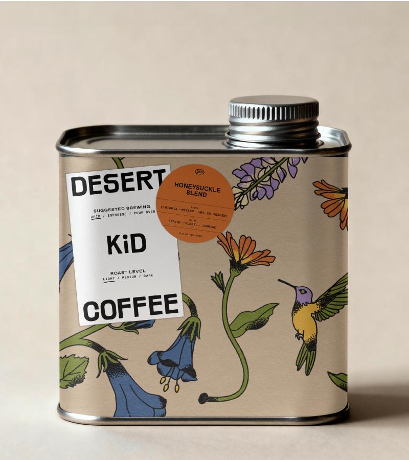
That commitment runs through every element of the identity. A custom illustration system draws on the Coachella Valley's most distinctive icons — the famously kitsch Cabazon dinosaurs, delicate hummingbirds, the fleeting spectacle of desert superblooms, the rugged outline of the Chocolate Mountains, and those signature purple sunsets. The typography feels raw and grounded, and the logomark carries softened edges that hint at the desert itself. The palette is warm and muted: oranges, purples, blues, yellows, greens.
The studio worked across every touchpoint: brand strategy and naming, visual and verbal identity, illustration, web design, and the environmental design of the café itself — a generous 5,000-square-foot space that feels like something the Valley has long been waiting for. There's a broader story here, too. An independent café opening in a spot not usually known for such things can't help but mark a cultural shift. Coachella is globally famous for its events, but they're all temporary – they arrive, they dazzle, then they move on.
Desert Kid Coffee reflects something quietly happening elsewhere: the people who left their hometowns to seek adventure in the cities, returning to their roots and bringing a little of that urban energy back with them. The café mirrors the graphic identity throughout, so that walking into the room and picking up a cup both feel like the same experience. Architecture, storytelling and graphics all trace back to the same source. As any designer will tell you, that kind of coherence is harder to achieve than it looks.
Article truncated for readability. Read the full piece →
The article discusses a unique brand identity rooted in local culture, which is significant for the industry, presents a fresh approach to branding, and offers actionable insights for brand strategy professionals.