Score
Margot Lvque On Launching Her New Foundry And Not Letting A Chatbot Steal Her Name
Margot Lévêque's launch of Claude Type emphasizes a brand strategy that values craftsmanship and intentionality over speed and automation. By holding onto her vision and the foundry's name despite challenges, she showcases the importance of authenticity and personal connection in branding, particularly in a fast-paced creative landscape.
Creative Boom: News Typography Margot Lévêque on her new font foundry, and why she stuck to her guns on the name Claude Type is nothing to do with AI, but in fact a quiet, deliberate argument that craft and slowness still matter in 2026. Written By: Tom May 8 April 2026 When Margot Lévêque, the French type designer whose client list reads like a Who's Who of cultural institutions (Hermès, Vogue, Prada, A24, Apple, Lemaire), launched Claude Type this January, she'd been quietly building it for three years. She had also, at one point, nearly abandoned the name entirely.
"I wanted to give up more than once," she writes, "especially when Claude AI was released. I even changed the foundry's name for almost a year, but it never felt right. In the end, this tribute was too sincere from day one." She held on, and the name stayed. Which feels entirely appropriate, because the whole Claude Type project is, in its quiet way, a rebuff to the culture of fast, automated and "good enough". A foundry built not for volume or velocity, but for something closer to its opposite. What's behind the name?
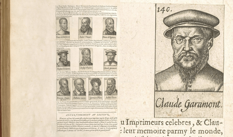
Margot's new font foundry is named after Claude Garamont, the 16th-century French punchcutter widely regarded as one of the great renovators of typography, but that's not quite the whole story. "Claude is also a tribute to Claudine, my grandmother," she reveals. "She was the person who quietly taught me what elegance means—a certain kind of chic, an old French sensibility, timeless and subtle—that's stayed with me ever since." The dual tribute tells you a great deal about how Margot thinks. She moves between the historical and the personal, the monumental and the intimate, and finds the distance between them smaller than you might expect.
"As a student, I kept coming back to Garamond again and again, but over time it started to feel a little too distant," she recalls. "I felt the need to get closer, to touch that heritage and gently shape it, to let my own voice exist within it: that's why I created Romie." This headline font, which became the seed of the foundry, took seven years to develop. Her other typefaces, Kalice and Ninna, took between three and four years each. For Margot, this is not a source of embarrassment but a point of principle. "Slowness, for me, is not a constraint.
It is the work." The couture model Margot has worked as an art director at Louis Vuitton in Paris and at Pentagram with Paula Scher, which gives her a particular vantage point on the relationship between type and the broader creative world. Claude Type is conceived explicitly as a couture atelier, not a traditional catalogue: "a place where each typeface is made slowly, with time and intention, the way a dress is cut before it is ever worn". "It is the first space that truly feels like me," she writes.
"A reflection of a vision I have carried for a long time, that typography deserves to stand beside fashion, photography and art, with the same visibility and the same respect." The entrancing website, shaped with International Magic and developed by 27Bureau, further reflects that ambition. It's not a font catalogue so much as a maison: spare, considered and quietly confident in a way that louder things rarely manage. The personal made professional For all its elegance, Claude Type also emerges from something more raw and practical.
Article truncated for readability. Read the full piece →
The article discusses a significant launch in the typography space that emphasizes authenticity in branding, which is highly relevant to brand strategy professionals, though the themes of craftsmanship and personal connection are not entirely new.