Score
What history's most ridiculous design brief can teach us today
The article highlights the creative potential of constraints in design, using historical matchbooks as examples of how limited resources can lead to innovative and memorable branding. For brand strategy, this serves as a reminder to embrace simplicity and creativity, focusing on meaningful design even in seemingly trivial contexts. By valuing thoughtful design at every level, brands can create lasting impressions through even the smallest touchpoints.
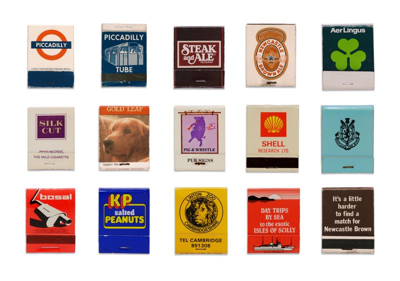
Creative Boom: Resources Books What history's most ridiculous design brief can teach us today A new book celebrating Britain's forgotten matchbook collection is an accidental masterclass in how designers can get better at their jobs. Written By: Tom May 1 April 2026 There's a matchbook in Billy Woods' collection that reads, simply, "Stolen from Harrods". Another advertises Hierons Luxury Mobile WCs. A third promotes the Hoverlloyd hovercraft service from Ramsgate to Calais with the immortal line: "Tell them to get hovered". Too young to know what I'm talking about?
In the days when most people smoked, matchbooks were small cardboard folders, roughly the size of a visiting card, containing a strip of paper, matches and a striking surface. Crucially, they were handed out free by businesses as pocket-sized advertising. None of them was meant to outlast the decade in which they were made. But looking back today, all of them are, in their own small way, brilliant. Matchbook Book, published this month by CentreCentre, collects over 250 of these tiny artefacts from Billy's personal archive: a collection originally found by his father and spanning roughly the 1970s to the late 1990s.
The book itself is a cleverly designed object: a 130x130mm softback that reproduces every matchbook at actual size, slipped into a glossy red sleeve that mimics its format, sealed with a single staple. It knows exactly what it is. But for anyone who works in design, advertising or visual communication, this book is more than a nostalgia trip. It's an uncomfortable reminder of something the industry has largely abandoned: the art of designing for nothing. The brief nobody took seriously The matchbook was, by any measure, a ridiculous commission.
A tiny surface area, handed to a designer with the instruction to make a brand feel memorable, premium, witty or trustworthy, depending on whether you were flogging Harp Lager, Apple Records, or the services of Dennis's School of Motoring in Snitterby. The budget was negligible. The print run was enormous. The lifespan of the object: until the matches ran out. And yet, flick through the pages of this book, and you'll find work that holds up. Bold typographic decisions. Playful illustration. Unexpected flashes of colour. The occasional piece of copy so good you'd kill to have written it. Someone, somewhere, cared deeply about a matchbook.
That care shows. This is what designers mean when they talk about the creative power of constraints. The matchbook gave you almost nothing to work with: a tiny canvas, a functional object, a minuscule budget. And somehow that limitation forced invention. There was no room for hedging. No space for the kind of bloated, committee-approved visual language that fills so much brand communications today. You made a decision, and you lived with it. What we lost when we stopped smoking The cultural shift away from matchbooks happened gradually, then all at once.
Smoking bans, the rise of the disposable lighter, the slow death of the kind of pub, restaurant or hotel that once pressed branded matches into your hand on the way out. By the late 1990s, the matchbook had all but vanished from British life. What went with it was an entire category of considered design at the smallest possible scale. Every touchpoint mattered when touchpoints were physical. A matchbook sitting on a bar or in a coat pocket was doing brand work every time someone picked it up. Designers knew this. The best of them treated it accordingly.
Article truncated for readability. Read the full piece →
The article discusses the creative potential of constraints in design, which is relevant and actionable for brand strategy professionals, though the concept itself is not entirely new.