Score
KATSEYE Brand Identity: HuskyFox Builds a Custom Slab-Serif
The KATSEYE brand identity, crafted by HuskyFox, emphasizes a custom slab-serif typeface that balances boldness and elegance, reflecting the group's unique position in the music industry. This strategic design choice not only enhances brand recognition across various formats but also aligns with KATSEYE's dual cultural influences, making it a compelling case study for effective brand strategy in the competitive landscape of K-pop and Western pop.
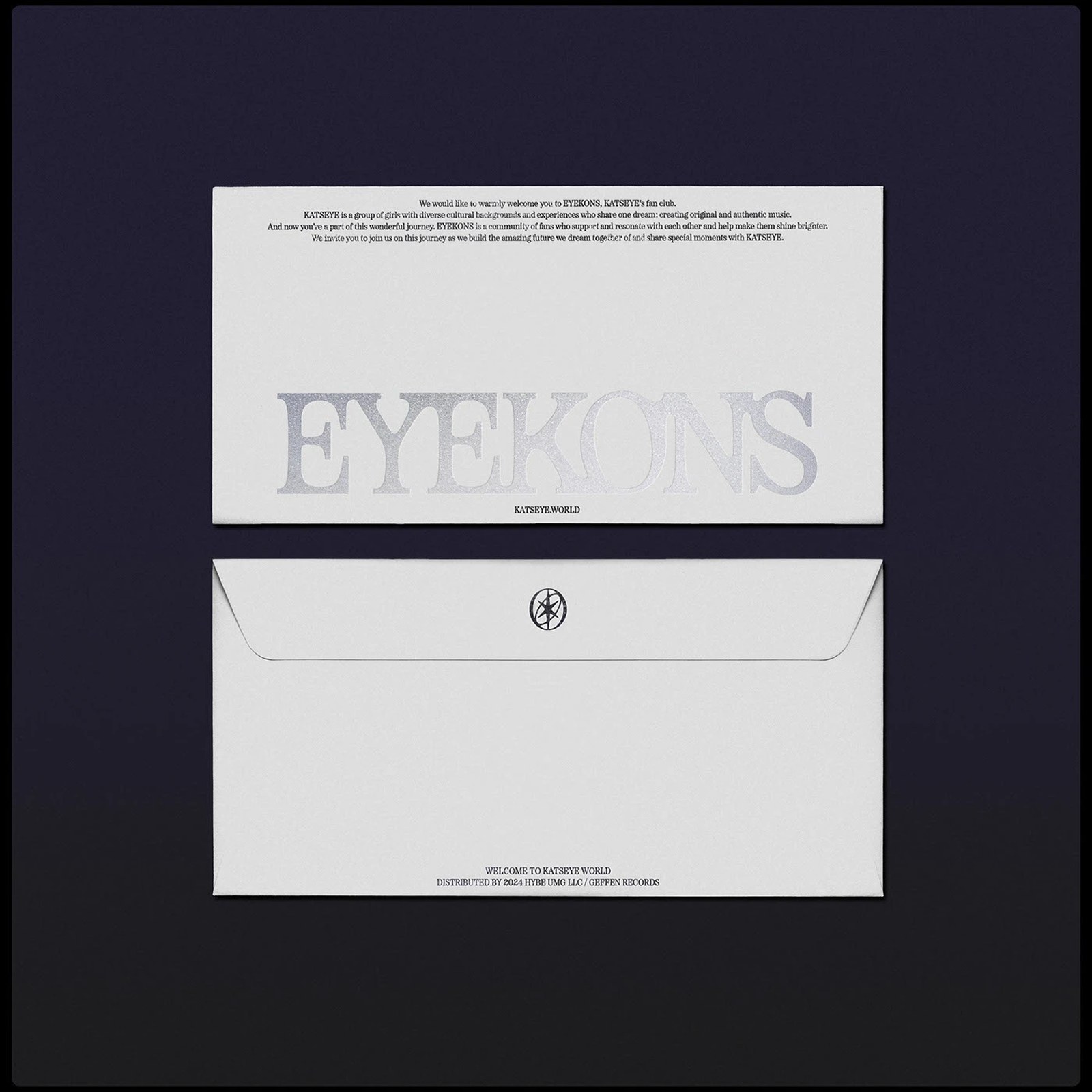
Abduzeedo: KATSEYE Brand Identity: HuskyFox Builds a Custom Slab-Serif marcus April 03, 2026 HuskyFox built the KATSEYE brand identity on a custom slab-serif typeface using a gemstone dual-structure, pairing hard strokes with fluid type counters. Seoul-based HuskyFox designed the full visual system for KATSEYE, the global girl group formed through HYBE and Geffen Records' joint program The Debut: Dream Academy. The project covers the wordmark, emblem, album packaging, and merchandise. Brand New (Under Consideration) gave it a full write-up, a quality signal that places the work alongside the most craft-driven identities in music branding.
The Behance project has crossed 4,000 appreciations and nearly 40,000 views since November 2024. KATSEYE Brand Identity Built on a Gemstone Logic The defining move in the KATSEYE brand identity is the custom slab-serif typeface. HuskyFox built the letterforms around a gemstone metaphor: thick, saturated main strokes that taper into delicate transitions at the terminals. Each glyph carries the tension between a hard outer edge and a softer interior form, the same dual-structure logic applied to the gemstone emblem. The outer shell reads as a clean geometric form while the inner facets suggest movement and light.
The approach fits KATSEYE's position between K-pop's high-production visual culture and Western pop's more open identity space. The group's Gap campaign and TikTok virality give the brand surface area to work across at every scale. The slab-serif holds at all sizes: thick strokes read clearly at small formats while delicate transitions keep the texture refined at large ones. What designers are studying here is how a slab-serif can carry both logotype weight and fashion-mark elegance.
HuskyFox resolved that by treating each serif bracket as a structural load-bearing decision, not a stylistic one.
The article discusses a notable brand identity project in the competitive K-pop and Western pop markets, making it significant and relevant for brand strategy professionals, while the use of a custom typeface adds a level of novelty.