Score
Birga Beer Packaging Design Bets Bold Typography on a New Market
The bold typography used in Birga Beer’s packaging design aims to effectively reposition the brand within a developing Central Asian market, highlighting the importance of visual identity in brand strategy. By focusing on scale and distinctiveness, the design seeks to resonate with local consumers and establish a strong market presence.
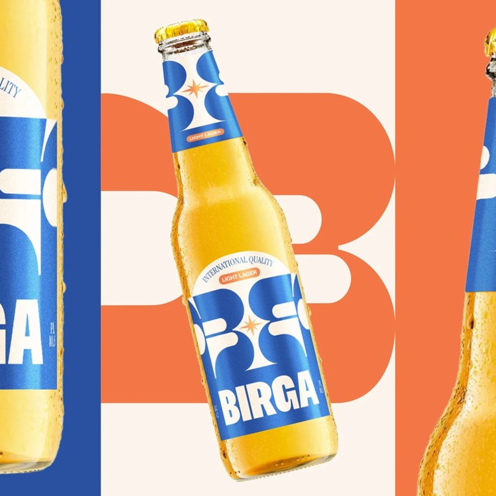
Abduzeedo: FCB Artgroup Tbilisi's beer packaging design uses bold typography to reposition Birga beer for a Central Asian market where the culture is still forming. The central decision is scale. The ‘B’ letterf...
The article discusses a strategic rebranding effort in a developing market, which is significant for brand strategy professionals, while the use of bold typography offers a fresh perspective on packaging design.