Score
This Rebrand Finds Its Entire Personality In One Tiny Typographic Flourish
The rebrand of Wottz by Lark Design Studio exemplifies how a focused and minimalistic approach can effectively convey a brand's personality. By incorporating a subtle lightning bolt into the typography, Wottz communicates its commitment to detail and innovation in the EV charging industry, proving that a single strong idea can be more impactful than an elaborate design.
Creative Boom: News Branding This clever rebrand finds its entire personality in one tiny flourish Lark Design Studio's new identity for EV cable brand Wottz proves that the best ideas sometimes hide in the smallest details. Written By: Tom May 6 July 2026 Some rebrands are worth studying not for their scale, but for their restraint. Lark Design Studio's new identity for Wottz, a British manufacturer of customisable EV charging cables, is one of them. There's no sprawling illustration system, no 30-page brand world bible full of abstract metaphors. Just a wordmark, a colour pairing and one clever piece of letterform thinking that does most of the legwork.
In an industry that often confuses more with better, Wottz is proof that a single sharp idea, properly executed, can carry a whole brand. For a studio working with founders and marketing teams rather than blue-chip clients with bottomless budgets, that's not just good design thinking, it's good business sense too. So what's the idea? A lightning bolt, hidden inside the crossbar of the double "tt" in Wottz. Blink, and you'd miss it. But that's kind of the point. The old identity, with its looping green cable shapes and a fairly generic blue wordmark, told you the company made EV chargers, but not much else. It looked fine.
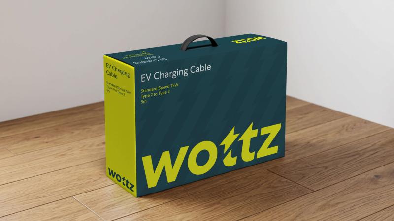
But didn't look obsessive. And obsession is exactly what Wottz wanted to communicate. For context: the business builds cables to order for each customer's exact setup, tested against 28 safety points, for every EV on the planet. That level of fussiness needed a brand that feels just as considered. Lark's answer was to find the personality in the name itself. Wottz, after all, already sounds contemporary and plugged into EV energy. So rather than piling on more visual metaphor, the studio sharpened the wordmark and tucked a tiny lightning strike into the crossbar of the two Ts.
It's a detail you have to look for, but—much like the hidden smile in Amazon's logo or the secret arrow in FedEx—it makes spotting it satisfying rather than gimmicky. Designing for the parts nobody else bothers with Around that wordmark sits a tight, disciplined palette: the existing core blue paired with an arresting neon yellow that feels ownable in a category full of safe, slightly clinical colourways. The typeface, Centra No.1, is a contemporary nod to cornerstone British fonts like Gill Sans and Johnston's New Rail Alphabet, giving the system a confident British feel without leaning on cliché.
The same cable-inspired typographic detailing turns up in custom icons, sharp little glyphs covering everything from forklifts to flexible payment options, drawn with the same minimal geometry as the logo. Packaging carries the wordmark at scale, bold enough to be read from across a delivery van. Even the connector heads, usually the most overlooked part of any charging cable, get a discreet embossed badge. There's a good lesson here for anyone working on a visual identity project. Namely, that the strength of a brand isn't measured by its hero assets, but by how well it survives the unglamorous bits.
A logo looks easy on a yellow background in a deck; it's a different test when it has to sit on a five-metre cable coiled in the rain, on a courier's tape gun, or stitched small onto a gilet pocket. Wottz passes that test comfortably, largely because the identity was built around one robust idea rather than a pile of decorative flourishes that fall apart at small sizes. The photography around the rebrand backs this up. Instead of the moody studio renders so many tech-adjacent brands reach for, the imagery here is bright, outdoorsy and domestic: a Honda parked on gravel, tulips in the foreground, a cable coiled casually on a doorstep.
Article truncated for readability. Read the full piece →
The article discusses a notable rebrand in the EV charging sector, highlighting a unique design approach that could inspire brand strategy professionals, though the concept of minimalism in branding is not entirely new.