Score
Why Pentagrams Samar Maakaroun Designed A Logo That Just Wont Settle
The rebranding of The Mosaic Rooms by Pentagram's Samar Maakaroun challenges conventional branding by embracing instability and movement within its identity system. This approach reflects the institution's commitment to cultural fluidity and the complexities of identity, suggesting that brands can thrive by not conforming to fixed visual representations but instead embodying a dynamic and evolving narrative.
Creative Boom: News Graphic Design Why Pentagram's Samar Maakaroun designed a logo that just won't settle How do you brand a space that refuses to be pinned down? For Pentagram's Samar Maakaroun, that was the brief. Written By: Tom May 28 April 2026 Most brand identities are built on the premise of stability. A logo should be consistent, recognisable and dependable, arriving at a single point and staying there. The identity that Pentagram partner Samar Maakaroun has developed for The Mosaic Rooms, a West London space dedicated to contemporary culture from the Arab world and beyond, does the opposite. It's designed to never quite settle.
And that, it turns out, is precisely the point. There's a particular kind of bravery involved in designing instability into the foundations of a brand system. Most clients, given the choice, will opt for the mark that feels solid, the palette that feels resolved, the system that feels finished. The Mosaic Rooms asked for something more uncomfortable than that. It asked for a brand that could hold tension without resolving it. The result is an identity that rewards close attention. On the surface, it's warm, energetic and confident.
Look longer, and you start to feel the movement running through it: the letters that won't sit still, the colours that carry an argument, the forms that suggest relation and entanglement rather than arrival. A space in transition The Mosaic Rooms reopened in Kensington in February 2026 following a major refurbishment by architectural firm A Small Studio, and the rebrand marks a significant moment in the institution's story. Founded in 2008 by the A.M.
Qattan Foundation under director Rachel Jarvis, the space spent its first 15 years as a platform for contemporary culture from the SWANA region, the collection of countries spanning South West Asia and North Africa, steadily challenging reductive narratives around Arab identity and revealing the depth and multiplicity of artistic voices from the region. Now under the direction of Pip Day and having transitioned from a privately funded initiative to a public institution, The Mosaic Rooms enters a new phase.
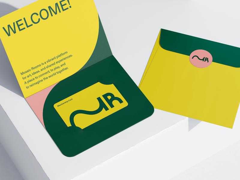
The redesigned building extends beyond gallery space into a venue for talks, learning, play and gathering: a place, as the institution puts it, where culture is not only shown but lived. The rebrand had to carry all of this. Not just a new visual identity, but a statement of intent about what kind of institution The Mosaic Rooms is becoming. The M that moves At the centre of the new identity is a monogram using the initials M and R. Simple enough on paper. But look closely at the M, and you'll see something interesting.
Rather than settling into its expected form, the letter stretches and extends, moving fluidly from right to left and from left to right simultaneously. The stroke that begins as one side of the M curves away, undulates and arrives, with quiet confidence, as the stem of the R. It's a mark that encodes movement, linguistic duality and the condition of living between cultures. Arabic reads right-to-left; English reads left-to-right. The extended M acknowledges both directions and commits to neither. It is, in Samar's framing, a fundamental condition of being in between: between languages, between places and between ways of seeing.
Article truncated for readability. Read the full piece →
The article discusses a significant rebranding effort by a renowned design firm that introduces a unique approach to brand identity, making it highly relevant and novel for brand strategy professionals.