Score
Prada’s NYC store turns scaffolding into high art
Prada's innovative use of scaffolding as a branding tool highlights the importance of transforming mundane elements into artistic expressions that reflect brand identity. By treating scaffolding as a medium rather than a mere functional necessity, brands can enhance consumer engagement and recognition, turning every touchpoint into a memorable experience that reinforces their unique aesthetic.
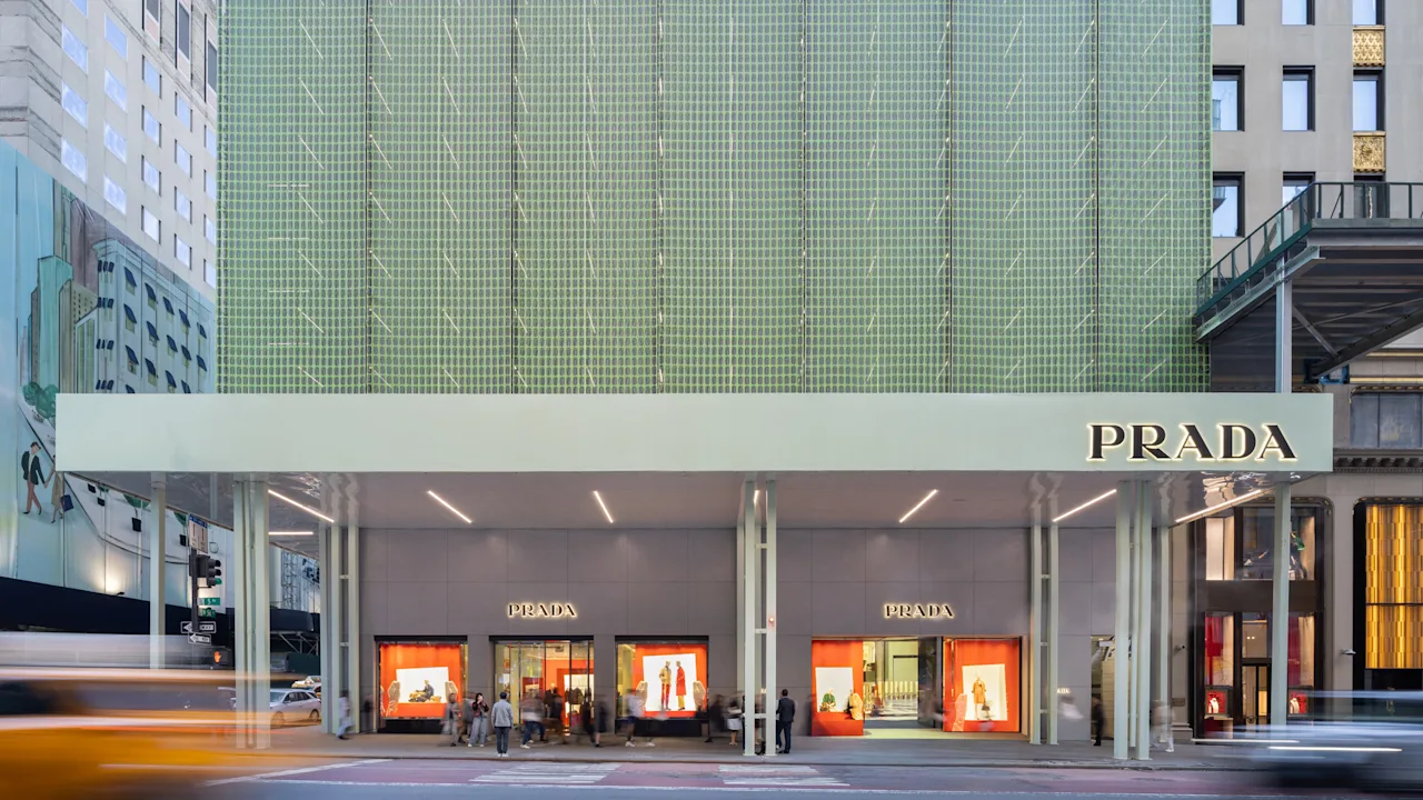
FastCompany: New York City’s famed Fifth Avenue is best known for its sparkling, fantastical holiday windows. Now, luxury brands are transforming an often overlooked, sometimes maligned part of city architecture—scaffolding—into artful branding displays. Located at the corner of Fifth Avenue and 56th Street, Prada has unveiled new scaffolding on its building, currently undergoing renovation, that covers its facade in rippling layers of semitransparent Prada-green scrim paper.
The result is a beautifully nuanced design solution that turns what’s typically a functional safety requirement into a moiré urban dreamscape that becomes a visual extension of Prada’s brand. Prada isn’t the first to reimagine scaffolding as a branding opportunity. Most recently, Louis Vuitton transformed its Fifth Avenue flagship store , just a few blocks north of Prada, into a sort of construction trompe l’oeil by making the scaffolding that wrapped its store appear to be a gargantuan set of stacked Louis Vuitton luggage. [Prada store on Fifth Avenue in NYC.
Photo: courtesy Prada] A reevaluation of what scaffolding could be is happening on a broader scale, too: The City of New York also recently approved six new sophisticated scaffolding designs —featuring lights, angled roofing, and clear materials—to make these temporary safety platforms, required by law when a building is undergoing construction, look less like MacGyvered dark green caves and seem more fluid, in keeping with their architectural surroundings.
Prada worked with its longtime spatial design partner, the agency 2×4 , to design the building’s covering (the intervention was installed by Spring Scaffolding , which also collaborated on the functional elements of the design). It had to build full-scale mock-ups in both Milan and New York to “test the impact of light, shadow, and movement,” says Michael Rock, founding partner and executive creative director at 2×4 .
“We treated scaffolding as a medium in its own right, not a backdrop.” While it uses standard commercial pipe scaffolding as the underlying structural skeleton, the deft layers of material, signature color applications, and contrast they draw signal the Prada brand and its interest in dualities, according to the company. [The Prada Store covered in artful scaffolding. Photo: courtesy Prada] The mesh is made of two layers of scrim paper—a reinforced, durable woven fiber material—printed with a pattern that references typical New York construction fencing, but in Prada green.
The scale of the pattern is different on each of the layers and had to be precisely aligned to create a moiré effect that shifts with light, weather, and viewing angle. At first, it looks like single-surface standard construction material. Someone with an eye for detail will notice a delicate optical effect. “Scaffolding is designed for speed, safety, and building code—not beauty,” Rock says. “The challenge was working within that strict system while transforming it into something intentional and architectural.” Color also plays a significant part in maintaining the building’s brand recognizability on street level.
Article truncated for readability. Read the full piece →
Prada's creative approach to using scaffolding as a branding tool represents a significant shift in how brands can engage consumers, making it highly relevant and novel for brand strategy professionals.
Weekly digest
Get the Signal digest
Every Monday morning — the top 3 brand trends, 10 high-signal articles, and one emerging signal to watch.
No spam. Unsubscribe anytime.