Score
Poshmark finally redesigned its clunky app
Poshmark's recent app redesign marks a significant shift in its brand strategy, focusing on user experience and visual storytelling to engage younger consumers. By simplifying the interface and prioritizing aesthetic appeal, Poshmark aims to enhance the shopping experience, making it more enjoyable and aligned with the preferences of its target demographic, particularly Gen Z. This move not only positions Poshmark competitively against platforms like Depop but also reflects a broader trend in the resale market towards user-friendly design.
FastCompany: Fashion resale company Poshmark just got its first app redesign in 15 years, and it’s taking a page out of Depop’s book of UI. The new look encompasses an updated algorithm, redesigned navigational tools, and a new, streamlined aesthetic. It comes as a pivotal moment for the second market, which, according to ThredUp’s 2025 Resale Report , is expected to reach $367 billion by 2029, growing 2.7 times faster than the overall global apparel market.
The majority of this growth, the report notes, has been driven by young consumers—millennials, Gen Zers, and Gen Alpha shoppers who are familiar with buying products through apps or in-app features like TikTok Shop . And competition is getting more fierce in the resale industry in light of eBay’s recent acquisition of Depop, which will allow the two platforms to pool their resources (though Depop will retain its own brand and site). Technically, Poshmark’s user base is actually broader than Depop’s, boasting 165 million active users compared to Depop’s 56.3 million .
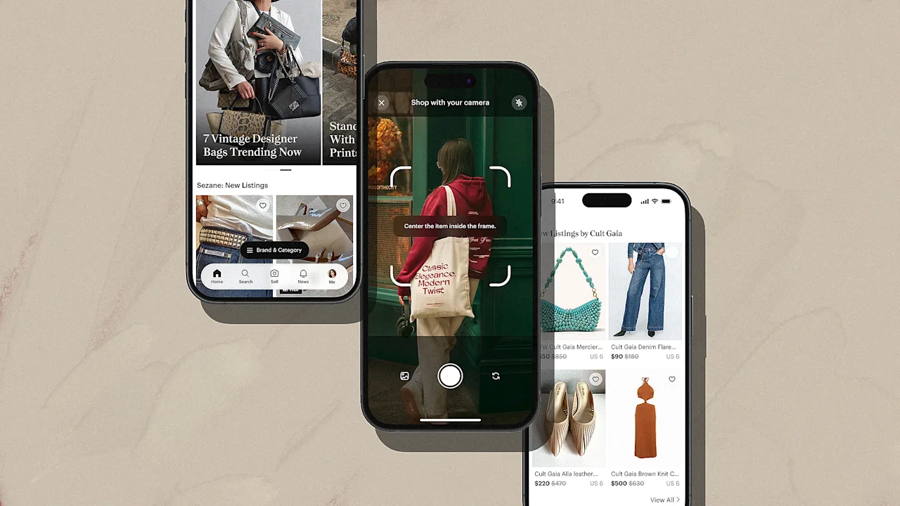
But unlike Depop, Poshmark’s previous app was not set up to capitalize on resale’s big moment, for the simple reason that it was difficult and unpleasant to use. Crowded design and unintuitive sections made shopping on the app feel more like a chore than an enjoyable activity. Now, though, Poshmark appears to be taking notes from its Gen Z-centric competitor and other social media sites to design an app that’s both easy on the eyes and easy to use. “The former UI was focused on transaction over inspiration” The first word that comes to mind to describe Poshmark’s previous app is clutter .
Opening the app would lead to a front page, called the “Feed,” which was bisected into a page of recommended items and a page of Poshmark sellers hosting livestreams. Each featured item was previewed inside a small window, allowing nearly six items to fit onto the page at a time. Most of the page was black and white, but some pops of the brand’s signature purple would appear on highlighted pieces of text. [Screenshot: courtesy of the author] Navigating to the app’s search function only made matters worse.
Underneath the general search bar, the app included a laundry list of suggested destinations, like popular brands, the user’s liked items, and, for some reason, more live Poshmark shows. These were accompanied with additional tiny images of items and previews of livestreams. [Screenshot: courtesy of the author] The result of these design choices was an extremely information-dense experience. Looking at the old Poshmark app felt like being bombarded with layers of text and imagery that the user would need to dig through to find even a nugget of interest.
“The former UI was focused on transaction over inspiration,” says Heather Gordon Friedland, Poshmark’s chief product officer. “For shoppers, this often translated into a feeling of ‘endless scrolling,’ making it challenging to find unexpected pieces that matched their personal style.” Poshmark gets the Depop treatment In comparison, the new design is a breath of fresh air.
Article truncated for readability. Read the full piece →
The redesign of Poshmark's app is significant for the brand as it reflects a strategic shift to engage a key demographic, making it impactful and relevant to brand strategy professionals, though app redesigns are common in the industry.