Score
EKEN Brand Identity: Warmth in Geometry
The EKEN brand identity emphasizes the fusion of warmth and minimalism, showcasing how a well-crafted visual identity can enhance brand perception. By utilizing geometric design elements and an earthy color palette, EKEN positions itself as a modern yet inviting furniture brand, which is essential for attracting a contemporary audience.
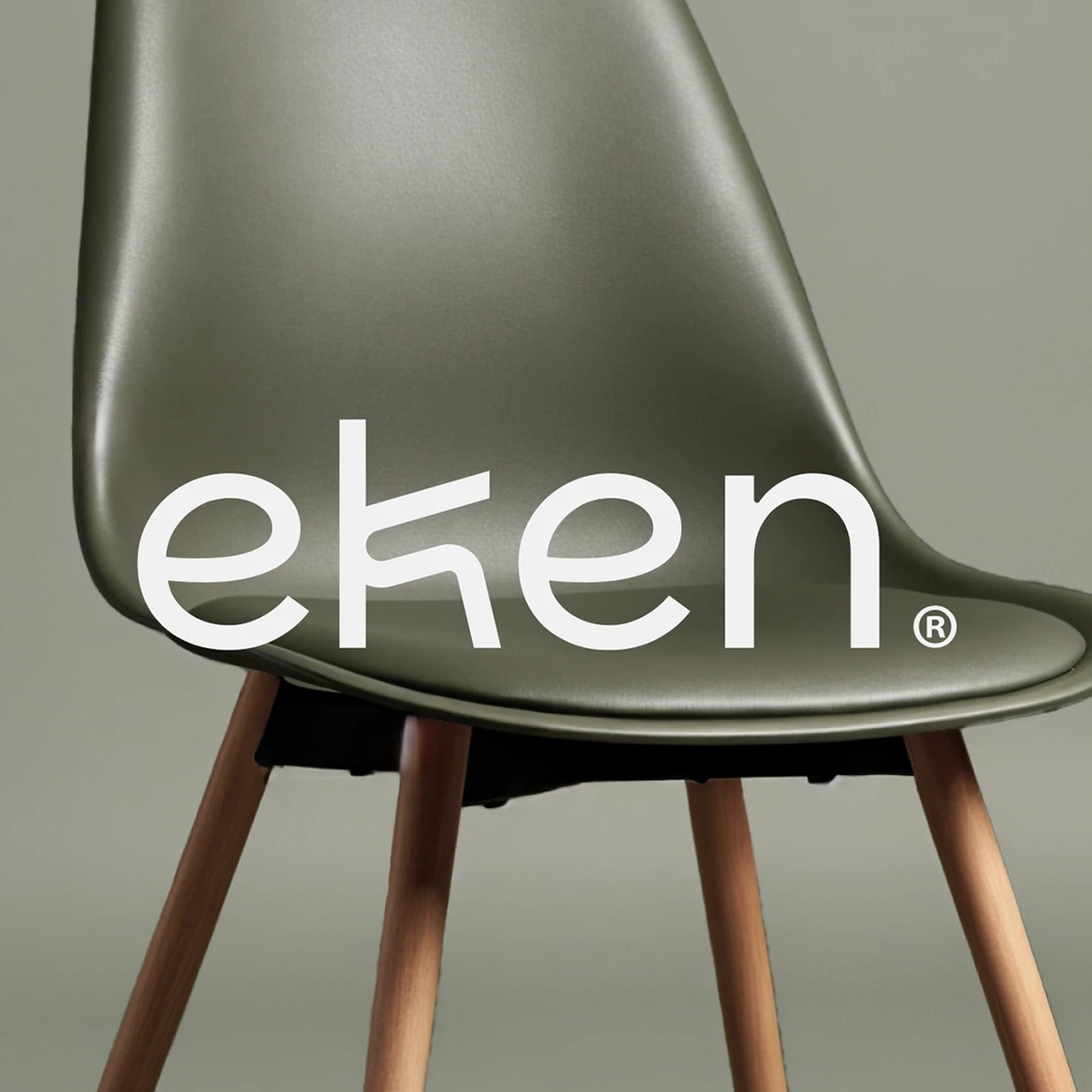
Abduzeedo: Creavora creates a furniture brand identity for EKEN that merges oak wood warmth with minimalist geometry. The system includes geometric logo, earthy color palette, contemporary typography, and cohesi...
The article discusses a specific brand identity case study that offers insights into design principles, making it moderately impactful and relevant, though the concepts of minimalism and geometric design are not entirely new.