Score
Typographic Maps of London by Dex at Run For The Hills
Dex's typographic maps of London represent a unique fusion of typography and cartography, creating a brand strategy that emphasizes storytelling through design. By using hand-crafted type to represent cultural references in specific locations, these maps not only serve as artistic expressions but also as innovative marketing tools that engage audiences with the rich narrative of the city. This approach highlights the importance of integrating creativity and narrative into brand identity.
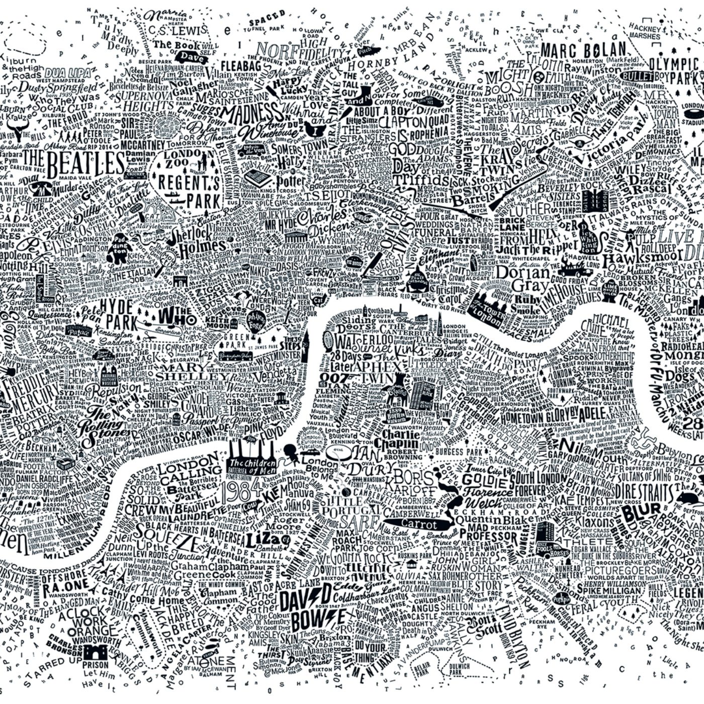
Abduzeedo: Typographic Maps of London by Dex at Run For The Hills jeff April 28, 2026 Dex's typographic maps of London use hand-crafted type to plot novels, films, and songs at real London locations — a ten-year project, one map at a time. The series began in 2012 with the Literary London Map — the first typographic maps of London to treat fictional characters as cartographic data. Dex , founder of Run For The Hills , builds each map entirely from letterforms: no base cartography, no icons, no color-coded legend. The city's outline emerges from the accumulated weight of titles, names, lyrics, and characters placed where they belong.
In the Music Map, Abbey Road and Waterloo Station read as geography because the songs referencing them are dense enough to form a street. Each of these hand-crafted typographic maps of London takes between nine months and a full year to complete. The Culture Map and a Decade of Typographic Maps of London The conceptually sharpest piece is Storylines: the tube map's full topology preserved, but every line renamed as a storytelling genre. The Northern Line becomes the Horror Line. The Bakerloo becomes Crime & Mystery. Where lines intersect, genres cross over. The map still works as a map — that constraint is what holds the idea.
The Culture Map of London closes the series as a greatest hits at the highest density Dex has reached, combining literary characters, film titles, and musicians. Featured in Time Out, The Evening Standard, and on the cover of Japan's Brain Magazine, these typographic maps of London occupy a rare category: cartography that reads as typography, and typography that navigates as a map.
The article discusses a creative approach to branding through typographic maps, which is innovative and relevant to brand strategy professionals, although it may not have the same broad impact as a major corporate rebrand.