Score
The ‘Bait’ title cards are an analog homage to spycraft, with their own hidden codes
The innovative title cards for the series 'Bait' serve as a strategic element in brand storytelling, using layered typography and color filters to reflect the protagonist's complex identity and invite viewer engagement. This approach emphasizes the importance of visual identity in conveying deeper narratives and enhancing audience connection, suggesting that brands can benefit from incorporating multi-dimensional design elements that encourage interaction and interpretation.
FastCompany: The title cards for British actor Riz Ahmed ’s new dramedy, Bait , are a colorful explosion of letters and numbers. If you look a little closer, each one reads like a code hidden in plain sight for you, the viewer, to unravel. Bait is a six-episode series that debuted on Prime Video on March 25. It stars Ahmed (who also created and cowrote the show) as Shah Latif, a struggling actor whose leaked audition to play James Bond incites a media frenzy.
Each episode tracks Shah’s exponential spiral as his private life is made public, forcing him to contend with his own identity, belonging, self-worth, and the cultural narratives mapped onto him as a British-Pakistani actor competing for a historically white role. [Image: Bait /© Amazon MGM Studios/Left Handed Films (client)/courtesy Pentagram] To create the show’s title cards, its creators tapped the London branch of the design firm Pentagram . Firm partners and brothers Luke Powell and Jody Hudson-Powell used a system of color filters and letterforms to encode multiple different words and messages in each sequence.
These practical effects create a visual language that mirrors the show’s core theme of an identity in flux—and cleverly invite the viewer to do some soul-searching of their own. [Image: Bait /© Amazon MGM Studios/Left Handed Films (client)/courtesy Pentagram] A system of secret messages From the beginning of the brainstorming process, Luke and Jody’s team knew that they wanted to explore the idea of being “under the spotlight” as a visual proxy both for the classic James Bond opening sequence and Shah’s public spiral.
“This led us to explorations around spotlights vs searchlights, color scrollers and black light—different graphic methods at the boundary of spy thrillers, acting and theater—trying to find a space that could talk to the complexities of the shifting inner and outer perceptions of Shah’s identity,” says Alice Sherwin, a senior designer at Pentagram who worked on the project.
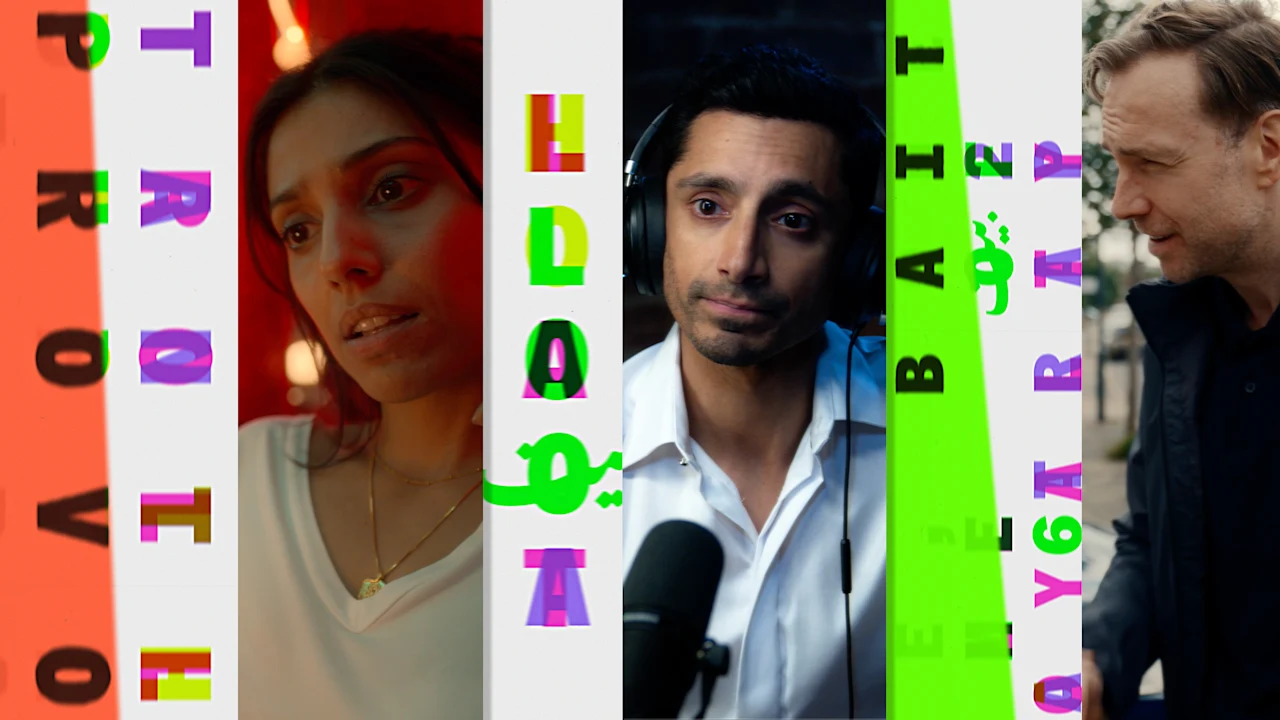
[Image: Bait /© Amazon MGM Studios/Left Handed Films (client)/courtesy Pentagram] Ultimately, they landed on a system that combines color filters with with a series of what Sherwin describes as “secret message reveals.” The base of every title card is the same: a white background with a myriad of multicolored letterforms and numbers layered on top of each other. Then, in each episode, a different colorful filter—similar to the gel scrollers that are commonly slipped in front of theater lights to quickly change their hues—is applied over that base, bringing certain messages to the forefront and relegating others to the background.
[Image: Bait /© Amazon MGM Studios/Left Handed Films (client)/courtesy Pentagram] As these filters are shifted into place, new layers of meaning to the show’s title, Bait , are revealed. In one instance, the Urdu symbol for “bait” appears directly above the word loyalty , which is how the word is defined in that language; in another, the word troll appears beside “provo” as a subtle reference to the British slang interpretation of “bait” as a provocation; and in a third, disparate letters come together to spell “of a trap,” i.e., bait as an incentive.
Article truncated for readability. Read the full piece →
The article discusses a unique approach to title card design that enhances brand storytelling, making it significant for the industry while also providing actionable insights for brand strategy professionals.