Score
Quebec beer Le Trou du Diable gets dominant-red visual refresh
The visual refresh of Trou du Diable's flagship products emphasizes the importance of a strong and cohesive brand identity, particularly as the company celebrates its 20th anniversary. This strategic move not only enhances brand recognition but also aligns with evolving consumer preferences, making it essential for brands to periodically reassess and update their visual elements to maintain relevance in a competitive market.
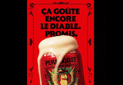
Strategy Online — CA: Devilish Quebec-based microbrewer Trou du Diable has overhauled its flagship products with a brand refresh to mark its 20th anniversary. Supported …
The article discusses a significant rebranding effort for a notable beer brand, which is relevant to brand strategy professionals, but the concepts presented are not groundbreaking in the context of brand identity refreshes.