Score
Creatives Are Deeply Divided Over The New Instagram Logo And I Think That Points To A Broader Issue
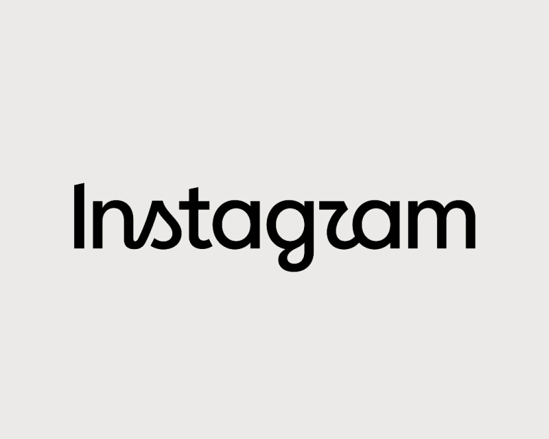
The recent redesign of the Instagram logo has sparked significant debate among creatives, highlighting a broader discussion about the role of design in branding. This division reflects the challenges brands face in balancing legibility, personality, and accessibility while evolving their visual identity, especially for established brands like Instagram that hold substantial equity.
Creative Boom: Insight Graphic Design Creatives are deeply divided over the new Instagram logo, and I think that points to a broader issue The new Instagram logo hasn't just raised a huge debate amongst creatives. It's also exposed a deeper divide over what design, in general, needs to do. Written By: Tom May 19 August 2026 I've been paying attention to Instagram since the very start. In the early 2010s, the audience was mostly designers and developers. In fact, I personally knew the person with the most followers on Instagram: the Bath-based web designer Mike Kus, who posted his photography there as a side project.
As I recall, his numbers were only overtaken when Justin Bieber joined in 2011. That's how big a cultural shift Instagram went through: from niche community to worldwide juggernaut in a matter of months. That wasn't the first big shift, though. In fact, when I chatted with founder Kevin Systrom at a conference around that time, he told me how Instagram had actually started as a mobile check-in app for lovers of fine whiskey. They figured people would want to post photos of their drinks; it proved to be a popular feature, and the whole thing kind of spiralled out from there. My point? Nothing about Instagram has ever been set in stone.
And so for me, watching the reaction to the platform's mild logo refresh this week has been somewhat eye-raising. But scratch the surface, and actually I think there's something deeper going on here. What's the problem? Let's start with the basics. The new design, a mix of handwritten and geometric text, is a long way from the clear, ultra-legible sans-serifs that have dominated tech design since around 2012. In one sense, that's good because, by gosh, have we all got bored with that one-size-fits-all style. But just going against the grain doesn't automatically win people over to your side.
And brand designer Sophie O'Connor speaks for many when she says: "The whole thing just feels off to me, like two typefaces arguing with each other. The 'r' feels like a z and doesn't flow as true cursive would." Graphic designer Anna van der Feltz agrees. "The z was the first thing I saw," she says. "I love the typeface, but the r just doesn't sit right. I can't believe they didn't see 'instagzam' when they were designing it, so maybe that's the result they wanted!" Brand and visual identity designer Larry Chikara had a similar reaction. "This hybrid sans serif/cursive typeface is kinda weird," he says.
"They probably looked at the wordmark in isolation and thought it too generic or lacked personality, 'so, let's add some cursive flourishes!' I would have liked to see a clean break with the past, and move away from any cursive elements completely." Even without such a visceral reaction to the aesthetics, there's a broader principle at stake. As designer Berenice Howard-Smith says: "As a designer and a nerd when it comes to typefaces, I don't mind it, but there's an accessibility issue that it could impact many, so it's not very thoughtful or inclusive. Which kind of feels very Meta." Does it need to be legible?
Some, though, take issue with the fact that the Instagram logo needs to be legible. As senior lecturer Graham Jones says: "In the context of the word, what else could it be? No one is really gonna say 'What's Instagzam?!' unless they've been living under a rock for the last decade. We don't read one letter at a time." I can see his point: when you see the full word, your brain fills it in. While illegible lettering may be a no-no when it comes to longer text passages, a logo might be considered a special case. Consider, after all, how many brands simply use a symbol rather than a wordmark.
Article truncated for readability. Read the full piece →
The article addresses a high-profile logo redesign that resonates with the brand/design industry, offering insights into the complexities of visual identity in established brands, making it significant and relevant for professionals in the field.