Score
Caffè Nazionale: Brand Identity Rooted in Veneto Street Life
Caffè Nazionale's brand strategy emphasizes a deep connection to local culture and community, utilizing design elements that reflect the everyday life of Veneto. By integrating vernacular typography and a revitalized mascot, the brand identity aims to resonate with the historical significance of the café while appealing to contemporary sensibilities, ultimately fostering a sense of belonging among patrons.
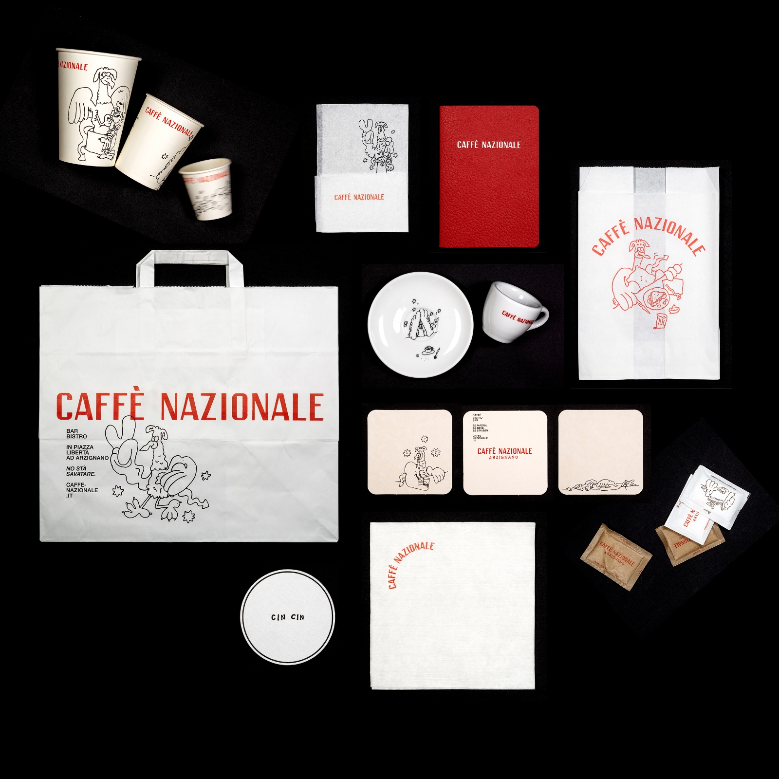
Abduzeedo: Caffè Nazionale: Brand Identity Rooted in Veneto Street Life alex April 02, 2026 Studio Mut's brand identity for Caffè Nazionale mines Veneto's street type and a griffon mascot to give a historic café back to the people of Arzignano. The brief was deceptively open: restore a beloved bar in Italy's Veneto region without making it feel like a brand. Caffè Nazionale had been the social heart of Arzignano's Piazza Libertà since the 1950s — a place for espresso at the bar, card games, and afternoon conversation — before closing in 2018.
When entrepreneur Marco Mettifogo, pastry maker Andrea Poli, and architecture practice AMAA teamed up to reopen it, they turned to Studio Mut in Bolzano to build the brand identity. Martin Kerschbaumer of Studio Mut describes the entire project as "restitution, giving the café back to the people it belongs to." That idea runs directly into every design decision. A brand identity drawn from the Italian street The typographic foundation pulls from the streets surrounding the 19th-century piazza — panini vans, parking signs, salumerie fronts, barbershops, laundries, car repair workshops.
Studio Mut distilled this vernacular into a bespoke handwriting font created with Berlin-based artist Stefan Marx and Swiss type foundry Dinamo. The loose, faux-naif letterforms walk a precise line: expressive enough to carry real personality, disciplined enough not to tip into nostalgia. Helvetica Neue Medium anchors the system as a secondary face — deployed for supporting information where the handwriting would be too much. The color palette keeps the same directness: black, white, and red, used across cups, packaging boxes, sugar sachets, crockery, napkins, uniforms, and signage. It reads like a hand-painted shop sign.
That restraint is what makes the bolder elements work. Stefan Marx also reinvigorated the griffon — a mythological figure that had long stood on a column outside the café, rendered crudely on its former door. Studio Mut saw in it the perfect mascot: an image already embedded in collective memory. Marx's new version shakes off the heraldic stiffness, rendered in wobbly black linework: carrying an espresso, sitting with a newspaper, moving through ordinary café rituals. The mascot evolves throughout the system, giving the brand identity real vitality.
The brand motto is drawn from Veneto dialect: "Se magna, se beve, se sta ben" — you eat, you drink, you have a good life. At Caffè Nazionale, an espresso costs one euro. Studio Mut's brand identity doesn't let anyone forget that.
The article discusses a unique approach to brand identity that leverages local culture, which is significant for the industry and offers actionable insights for brand strategy professionals.