Score
The perfect Knicks orange? It’s actually carrot
The MTA's effort to match the New York Knicks' iconic orange color for a subway station entrance highlights the importance of precise color representation in branding. This initiative not only strengthens the Knicks' identity during a significant moment but also showcases how public entities can creatively engage with local culture and sports fandom, enhancing brand loyalty and community connection.
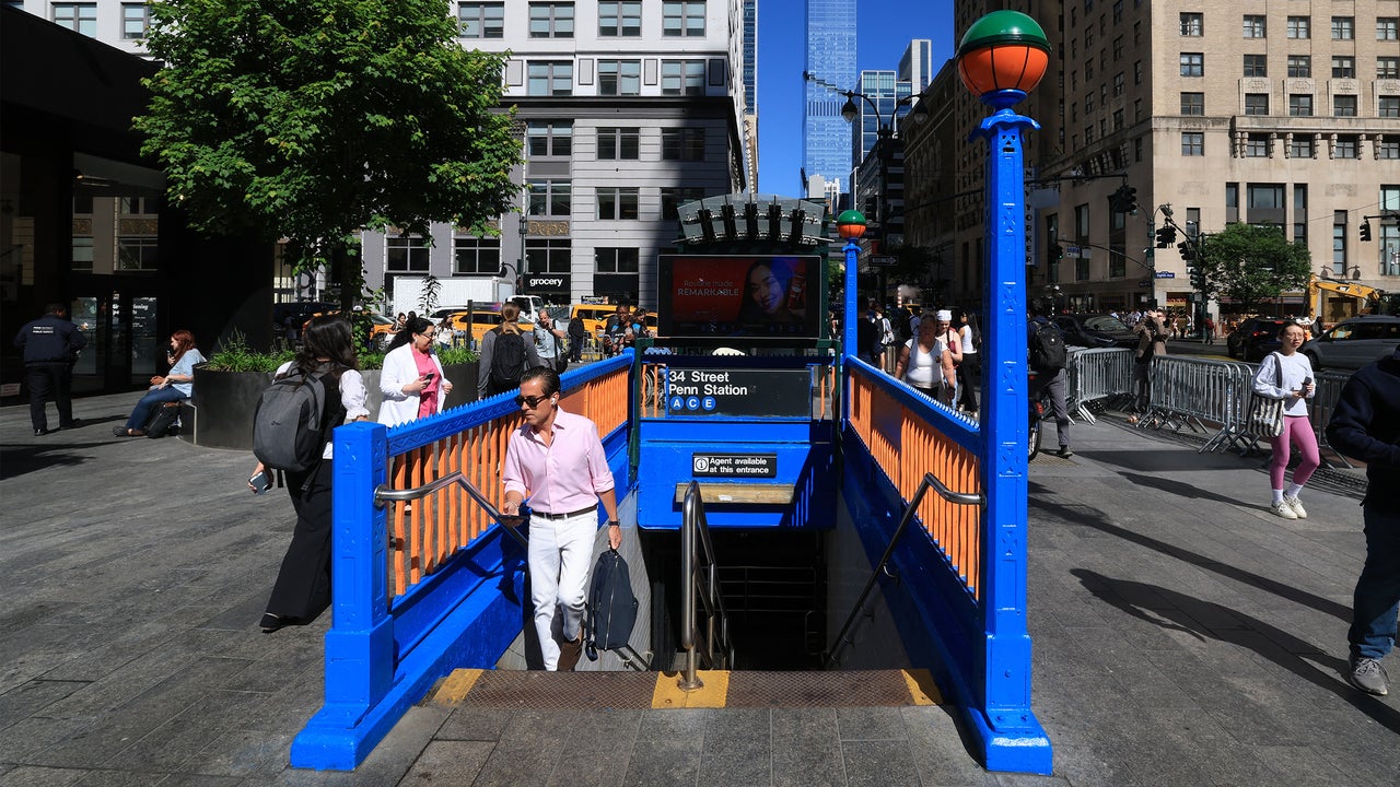
FastCompany: When the MTA painted the subway station entrance at 34th Street and Eighth Avenue just outside Madison Square Garden in team colors to commemorate the New York Knicks’ first appearance in the NBA Finals since 1999, the blue looked perfect, but MTA’s creative team knew the orange wasn’t a match. “We are New Yorkers. We are Knicks fans. We know this didn’t feel right,” Gene Ribeiro, deputy chief customer officer for the MTA, tells Fast Company . “We just wanted it to be absolutely perfect.” It turns out achieving perfection wasn’t as easy as pulling a Pantone swatch. It required a late-night search to find just the right shade.
[Photo: Timothy A. Clary/AFP/Getty Images] This isn’t the first time the Metropolitan Transportation Authority has made creative changes to facilities for special events. It’s often used Easter eggs across its system to celebrate occasions like Valentine’s Day or Pride. For St. Patrick’s Day, for example, station signage was adorned with shamrocks. For the Knicks’ first trip to the finals this century, Ribeiro’s team conceptualized a station entrance decked out in team colors—something they’ve never done before.
A typical green-hued NYC subway entrance [Photo: Wells Baum/ Unsplash ] The MTA typically paints its standard station entrances in a shade of green, so for this use case, new paint was in order. Since the beginning of the franchise, the Knicks have used a blue-and-orange palette that draws from the colors of the New York City flag, though the exact shades have changed over the years. The team’s orange is a saturated pumpkin color that is rich but bright, and a perfect complement to the blue. But when the MTA painted the station entrance, the first coat of orange paint didn’t look like a match. It was too yellow.
“We use the actual color codes, the Pantone color codes and the CMYK,” Ribeiro says. “But when you convert that into the actual color, sometimes it’s not an exaction conversation. So this is where you have to use a bit of judgment.” The paint job came together quickly, starting as an idea late Thursday that made its way swiftly through the approvals process and was executed and ready to go by early Monday morning. Getting an exact color match was tough, though. From front: The MTA’s Jen Chung and Jen Carlson buying paint at the Nuthouse hardware store in the early hours of the morning.
[Photo: MTA] Two MTA employees, senior promotions manager Jen Carlson and assistant director of promotions Jen Chung, had to visit the Nuthouse hardware store on Manhattan’s East Side—the city’s lone 24-hour paint store—to find a better shade of orange in the middle of the night. Ultimately, a shade called carrot did the trick. The repainted station entrance has since gone viral (“Some people didn’t even know if it was real or not,” Ribeiro says). But it’s not the only Easter egg the MTA’s creative team has planned for the NBA Finals.
The agency changed its social media avatar to team colors, electric signage on the train cars reads “Go Knicks,” and comedian-actor Tracy Morgan recorded a message encouraging fans to take the train to the games. There’s more planned, too, though Ribeiro wouldn’t spill any details. “I think we’re doing some pretty fun things, and we have more in store for sure, so keep an eye out,” he says.
Article truncated for readability. Read the full piece →
The article discusses a significant branding initiative related to a major sports team, highlighting the importance of color in branding, which is relevant and impactful for brand strategy professionals.