Score
What The Rebrand Of An Indian Caf Can Teach Us About The Power Of One Idea
The rebranding of Handmade Café by Rare Ideas illustrates the power of a singular, clear concept in brand strategy. By focusing on the idea of 'made from scratch' and applying it consistently across all touchpoints, the café has created a cohesive identity that fosters a sense of belonging and engagement among its customers.
Creative Boom: Inspiration Branding What the rebrand of an Indian café can teach us about the power of one idea When Rare Ideas branded Handmade Café, they proved that one single clear concept—when applied everywhere—beats a dozen clever ones. Written By: Tom May 29 April 2026 There's a temptation, when you're designing a brand, to reach for the toolkit. Gradients, geometric patterns, a sans-serif that costs a small fortune to license, some photography that looks vaguely like it belongs to a Kinfolk spread. It all says "brand" without necessarily saying anything. The result is a visual system that looks considered but somehow feels like nobody's home.
Handmade Café, a neighbourhood all-day café in Kalyani Nagar, Pune, India, is a useful antidote to all of that. Founded by three mothers who wanted to build a space where families could genuinely slow down, the café came to local brand studio Rare Ideas with a brief that was, at its core, refreshingly simple: make the care visible. The result, launched earlier this year, is a masterclass in what happens when a single idea is allowed to run the whole show. What's the idea? The idea in question is "made from scratch". In the food world, it's a phrase that's thrown around so freely it's almost lost its meaning.
But Rare Ideas did something interesting with it: they refused to let it stay in the kitchen. "Made from scratch is commonly understood as a way of preparing food," explains Vijeta Singh, founder and creative head at Rare Ideas. "For Handmade, it needed to function as a broader standard. It reflects a clear choice: effort over shortcuts, consistency over spectacle, and familiarity over constant change." The identity starts with the logo, and this is where the commitment to the founding idea becomes immediately legible.
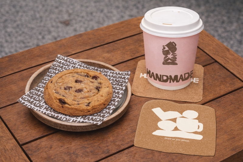
Rather than reaching for a contemporary wordmark with clean geometry, Rare Ideas looked to block-printing and clay-based craft traditions. The result is a stamp-like mark with a thick silhouette, softened edges and subtle irregularities that signal, at a glance, that something human made this. "The logo communicates made-from-scratch through structure rather than illustration," Vijeta notes. That distinction matters. It would have been easy to illustrate the concept literally: a pair of hands kneading dough, a coffee cup with steam curling into a leaf.
But instead, the stamp quality of the letterform does the conceptual work without explaining itself—exactly what good design is supposed to do. The wider visual system follows the same logic. Organic shapes, stacked in balance and printed with a texture that suggests relief printing, form the backbone of the collateral system. Everything feels slightly hand-touched. The palette—deep browns, off-white and a controlled muted pink—reinforces warmth without tipping into sentimentality. The coaster became the point Here's where there's a lesson for anyone working in brand or experience design.
Among the touchpoints Rare Ideas developed were coasters, shaped like slices of bread, designed with a generous amount of white space. The instruction printed on them: "Draw as you please." It sounds like a small thing. It isn't. "Children are treated as active participants rather than secondary visitors," Vijeta explains. "Coasters designed to be drawn on transform a functional object into a moment of making.
Article truncated for readability. Read the full piece →
The article discusses a notable rebranding case that highlights the effectiveness of a singular concept in brand strategy, making it significant and relevant for professionals in the industry, while also offering a fresh perspective on branding practices.