Score
Packaging: The Beemore Rebrand by Boundless
The article discusses the complete rebranding of the wellness drink Beemore by the London studio Boundless, featuring new can art that includes totemic sun-and-eye designs, ancient symbols, and bold color schemes. The rebrand aims to enhance the product's visual appeal and connect with consumers on a deeper level. Brand strategists can take note of the importance of visual identity in creating a strong brand presence in the wellness market.
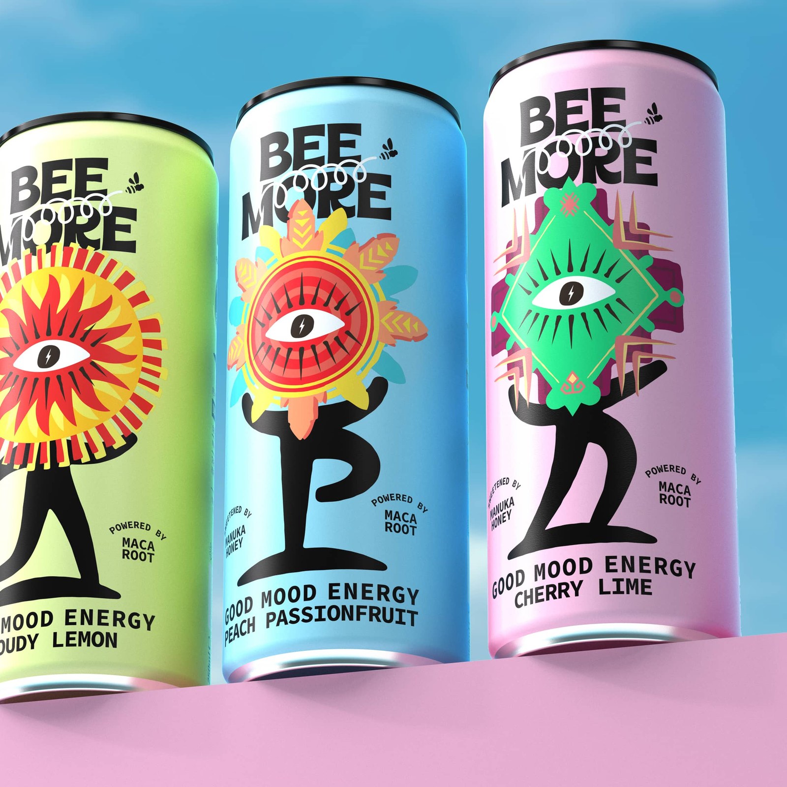
Abduzeedo: London studio Boundless gives wellness drink Beemore a full rebrand: totemic sun-and-eye can art, ancient symbols, bold colorways. Three slim cans against a blue sky. The Cloudy Lemon, Peach Passionfr...
The rebranding of Beemore by Boundless is significant within the wellness drink sector and highlights the importance of visual identity, making it relevant for brand strategists, though the concepts discussed are not groundbreaking.
Weekly digest
Get the Signal digest
Every Monday morning — the top 3 brand trends, 10 high-signal articles, and one emerging signal to watch.
No spam. Unsubscribe anytime.