Score
How Letters Come Alive Atelier Aaaaas Identity For Mixt
Atelier AAAAA's identity design for Mixt illustrates how a brand can thrive by integrating modularity and organic visual elements into its identity. By anchoring their design in a conceptual observation of particles, they created a flexible and dynamic visual system that adapts to various contexts, enhancing the brand's appeal and coherence across different mediums. This approach emphasizes the importance of a thoughtful and cohesive brand strategy that can evolve while maintaining a strong core identity.
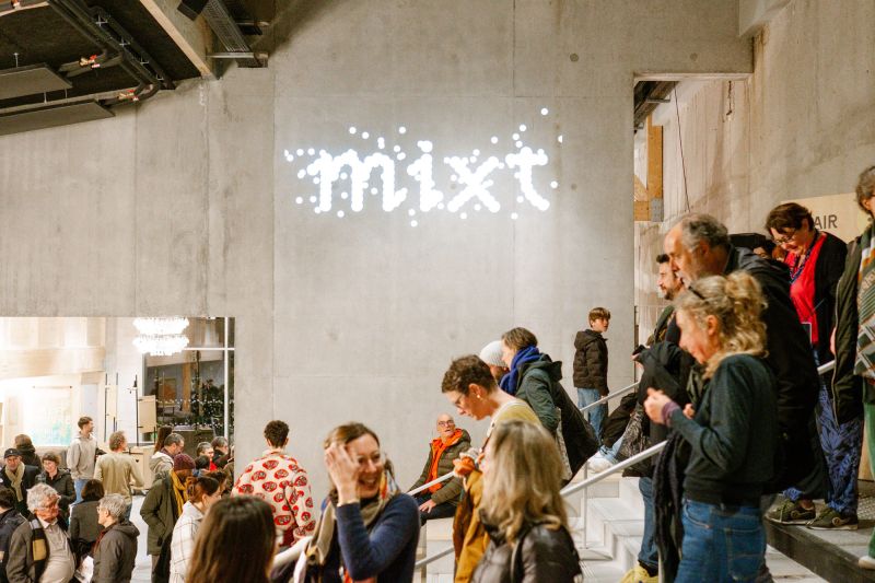
Creative Boom: Inspiration Branding How Letters Come Alive: Atelier AAAAA's identity for Mixt A Paris studio's identity for a new Nantes arts venue proves that the most ambitious visual systems often begin with the smallest idea. Written By: Katy Cowan 25 March 2026 There's a perfect moment in graphic design when a system stops feeling like a rigid structure and starts behaving like a living, breathing thing. That's exactly what Paris-based studio Atelier AAAAA has achieved with its visual identity for Mixt, a brand new multidisciplinary performing arts venue in Nantes. Even better, it's all built from something as small as a grain of pollen.
Founded in 2013 by Marie Sourd and Léopold Roux, Atelier AAAAA works at the intersection of art and craftsmanship, combining rigorous concept with hands-on making. Their client list spans cultural heavyweights including the Palais de Tokyo, Le Monde and the Centre Pompidou Metz, and their work is consistently characterised by a refusal to separate form from idea. The Mixt project is perhaps their most ambitious expression of that philosophy to date. Starting at the microscopic Mixt is a venue of two scales: an indoor complex of performance halls and studios, and an outdoor presence that extends across the Loire-Atlantique region.
The brief called for a visual ecosystem capable of holding both. AAAAA's solution was to anchor the entire identity in a single conceptual observation... that whether you look at the cosmos or through a microscope, everything is composed of particles. From that idea came Pollen, a custom typeface developed in collaboration with type designer Anne-Dauphine Borione. Rather than letters drawn in the conventional sense, each character in Pollen is constructed from modular shapes – small repeated units that cluster together to form letterforms.
The inspiration was literal: microscopic photography of pollen grains, with their incredible variety of surface textures and structures. The resulting alphabet has an organic, almost biological quality, somewhere between scientific illustration and street art. What makes Pollen really clever, though, is its flexibility. The modules themselves can be swapped. Human figures, botanical forms, geometric shapes, concentric circles... You name it. This allows the typeface to shift its personality depending on the performance or season it represents.
Scale the modules up, and the letters become bold and blocky; scale them down, and the text dissolves into a delicate scatter of particles. A diffusion setting causes letters to appear to disperse entirely, opening up rich possibilities for motion graphics and digital applications. A texture that breathes Alongside the typeface, AAAAA developed a second visual language, which they call Vibration. Working from photographs and other image sources, they apply a raster processing technique that transforms conventional imagery into dense, organic tapestries: plant-like surfaces full of detail and coloured in Mixt's vivid pop palette.
The effect is striking: photographs lose their documentary quality and become something closer to textile or landscape. It's a technique that brings together wildly different source material under a single visual temperature, which matters enormously for a venue programming theatre, dance and music simultaneously. A system built to last The real test of any identity for a performing arts venue is how it holds up at pace. Mixt's team produces new materials constantly, from posters, brochures and seasonal programmes to all kinds of digital assets. As such, the system needs to absorb that pressure with ease.
Article truncated for readability. Read the full piece →
The article discusses a significant rebranding effort that showcases innovative design principles, making it impactful and relevant for brand strategy professionals, though the concepts of modularity and organic elements are not entirely new.