Score
House of Croissants Visual Identity by Rare Ideas
The visual identity developed for House of Croissants by Rare Ideas emphasizes a focused brand strategy that centers around a single product, the croissant. By creating a cohesive visual system that integrates the product's characteristics into every aspect of the brand experience, the café aims to become the go-to destination for croissant lovers, showcasing the power of clarity and consistency in branding.
Abduzeedo: House of Croissants Visual Identity by Rare Ideas abduzeedo March 31, 2026 Rare Ideas built a visual identity for House of Croissants, turning a single product into the anchor of a neighbourhood café brand in Bandra Most cafés in Bandra treat the croissant as a side item on a long menu. House of Croissants took the opposite approach. Founded by Yesha, who spent years observing bakeries across Europe, the café set out to build an entire experience around one product. The goal was not just to serve good croissants but to become the place people think of when they want one.
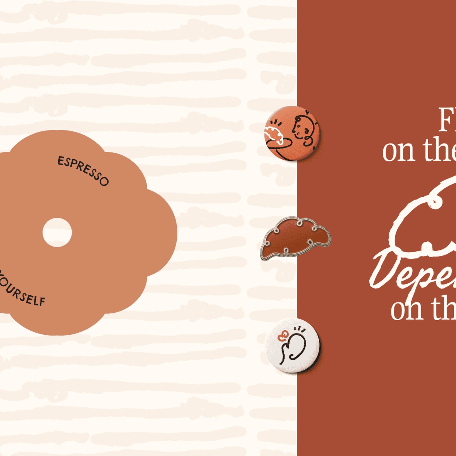
Pune-based studio Rare Ideas was brought in to define and shape that visual identity from strategy through to every physical touchpoint. Visual Identity Rooted in the Product The core visual idea draws from the croissant itself. A swirl motif, inspired by the cross-section of a croissant, became the central graphic element. It references the product without relying on literal illustration. The form feels warm, layered, and repeatable across packaging, interiors, signage, and digital communication. The logo uses a handcrafted typographic mark where the letterforms integrate swirl shapes directly.
Acronym lockups and a Devanagari version support local intimacy in Bandra. The color palette pulls from the croissant and baked goods: Butter Cream, Carbon, Raw Sienna, and Burnt Orange. Typography pairs Gupter for expressive headlines with Manrope for clarity, plus Freehand and Chelsea Market for character accents. Illustrated neighbourhood regulars appear as part of the visual identity system, reinforcing the idea of repeat visits and daily rituals. Layered, flaky patterns echo the croissant-making process and extend across sleeves, butter paper, menus, coffee cups, takeaway boxes, staff uniforms, coasters, and social media templates.
The visual identity system works because every touchpoint reinforces the same association. One product, one focus, repeated daily. By narrowing the scope, Rare Ideas helped House of Croissants achieve the kind of clarity that most hospitality brands struggle to find.
While the focused brand strategy for a single product is a relevant topic, the overall concept of visual identity and branding is common in the industry, making it moderately impactful and novel.