Score
How Derekeric Gave Manomasa A Latin American Glow Up With Snacks With Spirit
Derek&Eric's rebranding of Manomasa emphasizes the importance of aligning a brand's visual identity with its product experience. By infusing vibrant colors and lively Latin American elements into the packaging, the refresh aims to attract a broader audience and elevate the brand's presence in mainstream markets, moving away from its previous niche positioning.
Creative Boom: News Branding How Derek&Eric gave Manomasa a Latin American glow-up with 'Snacks With Spirit' The London studio drags the premium tortilla brand out of the farm-shop aisle with a vibrant new palette, dancing mascots and packaging that tastes as good as it looks. Written By: Katy Cowan 11 June 2026 You know those tasty snack-treats called Manomasa? The ones saved for special occasions or BBQs with friends, and only available from the "posher" supermarkets?
It's probably because of the premium offering and rather serious packaging – not to mention the muted tones and grown-up illustrations that describe exactly what high-end flavours might be waiting inside. Despite all this, the popular tortillas have just undergone a big brand refresh, thanks to Derek&Eric, the London-based design agency founded by Alex Stewart, Adam Swan, and Jon Gibbs. It's only when you see the new identity and packaging that you realise just how much an update was needed.
Since its launch, Manomasa ("Mano" is Spanish for hand, and "Masa" is the maise dough used to make traditional tortilla chips) might have built a small but devoted following (myself included), but it has struggled to shake off its reputation as a wholesome, "farm shop-esque" snack brand found only in premium retailers. Its parent company, Valeo Foods UK, wanted to break out of this niche and fling itself into the mainstream. How it achieved that began with a review of its strategy.
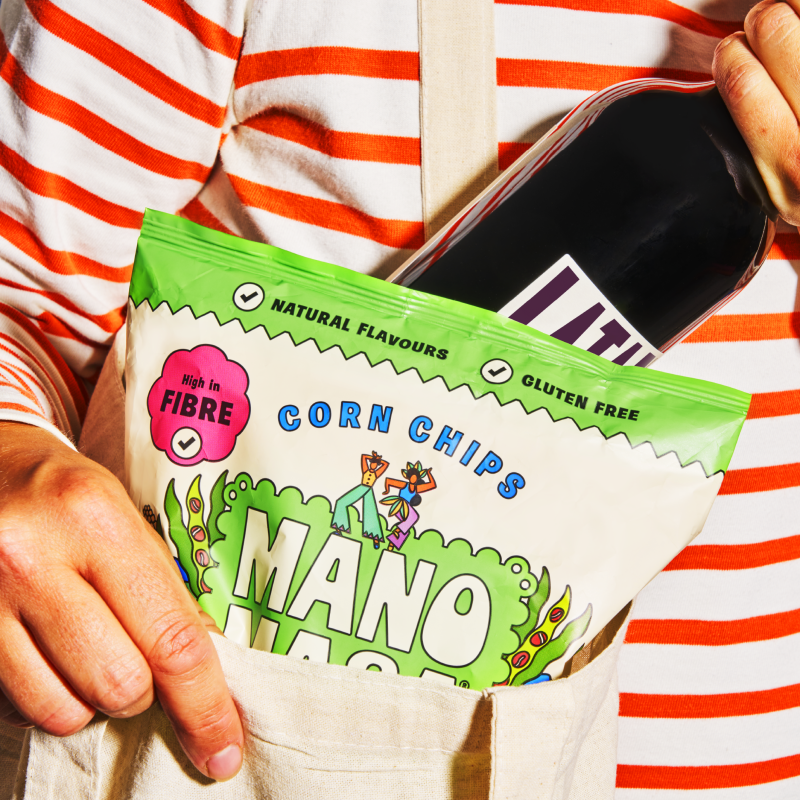
Derek&Eric went back to basics, focusing on what inspired the product in the first place: making the brand's look match how it tastes, while also drawing on influences from Latin America – its energy, passion, colour and warmth. It kept the existing layout of the packaging, with the logo front and centre, as well as the colourful display of ingredients and the cream background, but gave it all a lively Latin American feel. What that means is a glow-up founded on the tagline "Snacks With Spirit".
The palette, as you'd expect, is now satisfyingly vibrant, with splashes of teal, hot pink, bright orange, acid green, and happy yellow that instantly point out the different flavours. Yellow is pineapple and habanero chilli, by the way. We're not sure how that lands, but we're eager to try it. Derek&Eric also added a new icon featuring two dancers. Caught mid-dance, they convey a sense of rhythm that adds life and movement across all platforms. Accompanying materials for social media, recipe books, packaging, and delivery boxes with branded tape complete the refresh – all with their own happy drama.
There are even vinyl records and poster designs, which are hopefully up for grabs. (Derek & Eric, if you're reading this... tell us how to get our hands on them!) But, aside from the product packaging itself, it's the delivery trucks that are the best of all. Against a beautiful blue backdrop, illustrations decorate the surface… the two dancing mascots appear alongside the new logo in handwritten type. On the truck's rear doors sits a menu, as though it were something out of Jon Favreau's 2014 film Chef. I can almost hear the Latin vibes. It seems we're not the only ones to appreciate this overhaul: the project won Gold at the FAB Awards.
Article truncated for readability. Read the full piece →
The article discusses a significant rebranding effort for a snack brand that could influence industry practices, while also providing actionable insights on aligning visual identity with product experience.