Score
Newspaper Club Teams Up With Abcd8 On Nc Headline A Tabloid Inspired Typeface It Owns Outright
The collaboration between Newspaper Club and abcD8 to create the NC HEADLINE typeface signifies a strategic shift towards owning unique typography that enhances brand identity while avoiding ongoing licensing fees. This move not only reflects a commitment to creative ownership but also addresses the need for flexibility across various media formats, ensuring that the brand's visual identity remains dynamic and relevant in both print and digital spaces.
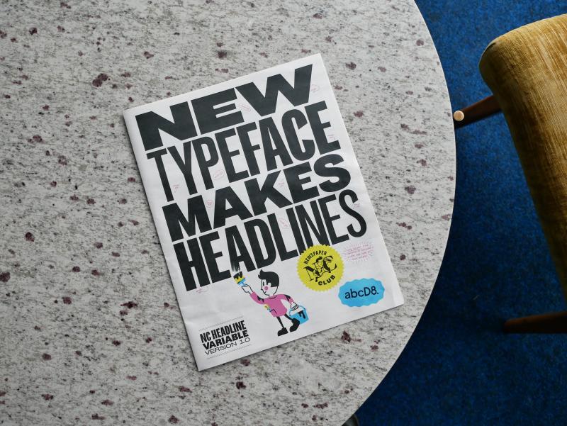
Creative Boom: News Typography Newspaper Club teams up with abcD8 on NC HEADLINE, a tabloid-inspired typeface it owns outright Drawing on the heyday of the tabloid press and the inspiring archives at St Bride, the all-caps variable font marks the launch of D8's new type studio – and a break from spiralling licence fees – ahead of its debut at Birmingham Design Festival. Written By: Katy Cowan 10 June 2026 Any discerning designer will tell you how expensive typography can get. Not to mention the minefield of licences and usage.
And when the fees on your headline font keep on climbing, and that typeface is the backbone of your visual identity, there comes a point where owning one outright makes more sense. That's why Anne Ward, CEO of Newspaper Club, has teamed up with old pals D8 to create a bespoke typeface, NC HEADLINE, that is uniquely theirs and no one else can use. It's the first of many typefaces for the creative agency, which this week has launched abcD8 – its new foundry that designs typefaces clients own outright, with no licence fees attached, ever.
Newspaper Club is its first customer, and what they've created will be revealed this week at Birmingham Design Festival, where a type specimen printed on the company's own tabloids – plus a short film documenting the process – will put the new font through its paces. To inspire its design, Anne and the D8 team went through St Bride Foundation's archives – the home of the printing press in London, and a brilliant place to visit if you haven't already. "Initially, we looked at the sophistication of broadsheet mastheads, but it felt like it really lacked the energy that Newspaper Club has," says Anne.
They turned instead to the heyday of tabloids, when typefaces like Interstate (Daily Mirror) and Franklin Gothic (The Sun) ruled the front pages. "Rather than simply copying the tabloid look, we wanted to refine it a little more and so combined it with more vintage styling, helping to make it more our own." The archives turned up many surprises, shaping the direction of the design. Show posters and how they handled certain character shapes, for instance. "We liked how they used variable-width characters to shout about something while using all available space on the poster.
That wasn't something we'd expected to study initially, but it ended up having a real impact on the design," says Anne. "Those references helped us round out and refine the typeface, giving it more personality and helping us resolve some of the character forms in a way that felt distinctive while still being rooted in print culture." Creating something with heritage whilst remaining forward-looking and modern is no easy task for any designer. Rules will inevitably be broken to accommodate both print and digital demands.
"From our perspective, we wanted to evoke the confidence and character of classic newspaper headlines, but we also needed something that could work seamlessly across all of our channels," adds Anne. "One of the biggest departures from our historical references was the emphasis on flexibility. Traditional newspaper headline typography tends to be quite static, designed for a specific context on a printed page.
Article truncated for readability. Read the full piece →
The collaboration highlights a significant trend in branding towards unique typography ownership, which is increasingly important for brand identity in a competitive market.