Score
The Lo Fi Look Of This Campaign For Half Batch Brewing Is A Lesson For Us All
Half Batch Brewing's latest campaign exemplifies how embracing a lo-fi aesthetic can enhance brand authenticity and engagement. By using playful visuals and character-driven storytelling, the campaign effectively connects with audiences in a way that polished productions often fail to achieve, highlighting the importance of personality in brand strategy.
Creative Boom: Inspiration Advertising The lo-fi look of this campaign for Half Batch Brewing is a lesson for us all Googly eyes, a tiny raft and a roadside bus stop: Stereo Creative's social-first work for Half Batch Brewing shows that imperfection, wit and character can outperform polished production. Written By: Tom May 28 April 2026 There's a moment, somewhere in the half-second before a thumb swipes past your content, when something either grabs attention or doesn't. For creatives working in commercial or product space, that moment is increasingly brutal, and it has quietly rewritten the rules of what "good" looks like.
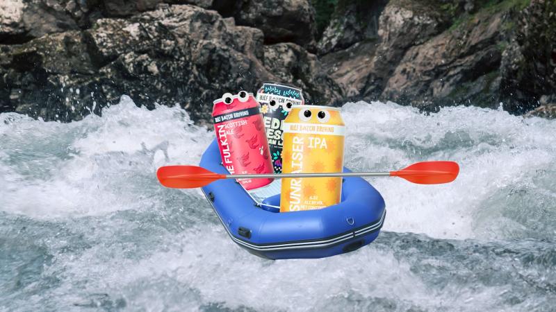
Enter Half Batch Brewing's debut brand campaign: "100% Beer", created by Austin-based studio . On the surface, it's a simple idea: stick googly eyes on beer cans, plonk them in absurd situations, and let their personalities do the talking. One set of cans goes white-water rafting in a tiny inflatable dinghy. Another waits at a desolate rural bus stop, leaning at a knowing angle. A third clusters around a backyard fire pit under string lights at dusk. The fourth peers out from a refrigerator shelf as a human hand reaches in to grab one. It's goofy, warm and instantly charming. It's also, from a visual storytelling standpoint, pretty clever.
The lo-fi paradox There's a paradox at the heart of modern commercial photography: the more polished your images become, the less trustworthy they can feel. Audiences have developed a finely tuned radar for "ad content", and when it triggers, they scroll straight past. The cliché of a product bathed in perfect studio light, isolated on white, or floating in a sea of minimalist negative space communicates professionalism but very little personality. What Stereo Creative understood, and what the Half Batch campaign demonstrates so neatly, is that lo-fi aesthetics can function as a form of creative honesty. The googly eyes are cheap.
The miniature raft is a prop you could buy on Amazon. The bus stop location looks like somewhere you'd drive past on a grey Tuesday without stopping. And yet the campaign feels alive in a way that £50,000 studio shoots often don't. This is intentional imperfection as strategy, not laziness. Character over product For creative directors, the campaign offers a more specific lesson: the best product images don't just show the product, they give it a role to play. Each Half Batch can here is a character with implied wants and feelings. The can at the bus stop gives off a weary, deadpan energy.
The ones on the raft are clearly having the time of their lives. The personality of each brew, whether it's the bold Sunraiser IPA, the rich Fulkin Scottish Ale or the vibrant Pedro Fresco Mexican Lager, maps onto the scene it's placed in. The art direction and the liquid inside it are saying the same thing. That kind of coherence between product identity and visual storytelling is something photographers and art directors often talk about, but rarely achieve this cleanly. Social-first isn't a format, it's a mindset "Designed to stop viewers mid-scroll," reads the campaign brief, and it's worth sitting with that phrase.
Stopping a scroll is a different creative problem from stopping a page-turn in a magazine or a glance at a billboard. It requires a different kind of visual grammar: something that reads instantly, rewards a second look and feels like it belongs in a feed rather than interrupting one. The use of what the team calls IYKYK language ("if you know, you know") is part of that. These images don't explain themselves. They trust the audience to get the joke, and that trust is flattering in itself. It makes the viewer feel in on something. It's a useful reminder that context is creative direction.
Article truncated for readability. Read the full piece →
The article discusses a unique approach to branding through a lo-fi aesthetic, which is increasingly relevant in today's digital marketing landscape, making it significant for brand strategy professionals.