71Signal
Score
Score
I
Its Nice ThatJune 25, 2026Rapha’s brand identity is rebooted with six bespoke typefaces inspired by vintage cycling ephemera
Rapha's rebranding effort, featuring six bespoke typefaces inspired by vintage cycling ephemera, emphasizes the importance of heritage and nostalgia in brand strategy. By leveraging historical design elements, Rapha aims to strengthen its identity and connect more deeply with its cycling community.
◎ EmergingrebrandtypographyidentityRapha
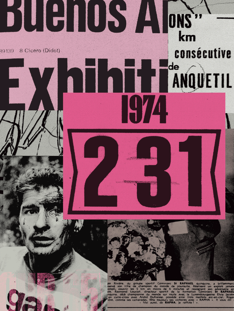
Its Nice That: Built by Six agency and Frost type foundry, the typefaces draw on vintage cycling magazines, race handouts, event graphics, race jerseys and technical manuals dug up from the brands archive.
Intelligence PanelSignal score: 70.5 / 100
Primary Signal
Emerging
Building momentum — trajectory being tracked
Brand Impact
Medium
Impact score: 70/100 — moderate relevance to positioning decisions
Novelty
Moderate
Novelty: 60/100 — iterative development of an existing theme
Action Priority
Soon
Flag for the next strategic review cycle
Scoring Rationale
The article discusses a significant rebranding effort by a prominent brand in the cycling industry, which is impactful for brand strategy professionals, particularly in the context of using bespoke typography to evoke nostalgia.
70
Impact
weight 35%
60
Novelty
weight 30%
80
Relevance
weight 35%
Brands Mentioned
RRapha
Related SignalsAll Signals →