Score
How The Best Whisky Label Of The Year Was Designed On Foot
The design of East London Whisky by Thirst emphasizes the importance of place in brand strategy, illustrating how authentic, location-based insights can lead to compelling and unique packaging. By stepping away from digital tools and immersing themselves in the environment, the designers created a label that resonates with the essence of East London, challenging traditional whisky design conventions and enhancing perceived value through craftsmanship and authenticity.
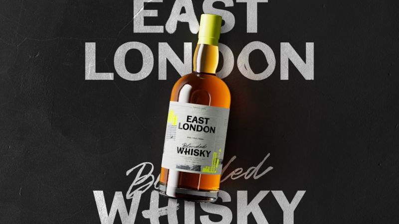
Creative Boom: News Graphic Design How the best whisky label of the year was designed on foot When Thirst ditched the moodboard and walked East London instead, they created something no algorithm could ever generate. Written By: Tom May 23 March 2026 One of the most talked-about booze projects of recent months very much went against the grain (so to speak). At a moment when the design industry is debating whether AI will consume creative work wholesale, one agency won the brief by doing something refreshingly, almost defiantly, analogue. They went for a walk.
The project in question was the new East London Whisky from East London Liquor Company, the distillery's first foray into blended whisky. The design was by Thirst, the brand agency that works with ambitious drinks companies from its studios in Glasgow and New York. The result is a label that feels genuinely rooted in place rather than assembled from category conventions, and it's worth picking apart exactly how they got there. The brief nobody should underestimate On paper, the brief sounds manageable enough.
Create packaging for a new blended whisky that sits at an accessible premium price point, feels worth it in the hand, and cuts through a shelf still crowded with tartan, heritage type and moody landscape photography. Simple, right? Well... not really, to be honest. After all, the whisky category is one of the most conservative in drinks design. Its visual grammar (aged leather, copper stills, coats of arms, typefaces that suggest ancestry rather than ambition) has been refined over generations precisely because it works. Shoppers are trained to read those cues as quality.
Disrupting them without losing credibility is genuinely difficult, and those who reach for novelty without substance tend to produce designs that look interesting for 30 seconds and then feel hollow. Thirst's solution was to disrupt the category, not by ignoring its logic, but by replacing its raw material. If traditional whisky premium is built on heritage, theirs would be built on place, specifically, on a very particular, very alive, very contradictory place: E1, E2, E3.
An urban safari and a very good idea Rather than building a creative world from moodboards and stock imagery, senior designer Alex Page and the client spent a day walking in East London. Not popping out for a quick recce; genuinely pounding the streets, photographing signage, architecture, textures, typographic accidents, the kind of visual material that accumulates on a city block over decades and can't be curated into existence on a screen. This sounds like an obvious approach, but it is actually quite rare. Remember, the pressure in most studio environments is toward efficiency.
So, because reference imagery is abundant online, and AI tools can generate visual worlds on demand, taking a designer off billable work for a day wandering around Bethnal Green can feel like a frivolous luxury. The fact that Thirst did it anyway and built their creative strategy around what they found tells us something profound about where genuinely interesting work is still being made.
Article truncated for readability. Read the full piece →
The article highlights a significant case study in brand strategy and packaging design, showcasing a unique approach that emphasizes place and authenticity, which is highly relevant to brand professionals.