Score
Inside the Craft of Reserva: Typography Design by Plau
The article discusses the typography design system created by Plau for the brand Reserva, highlighting the unique characteristics of the Reserva Script typeface, which combines traditional Copperplate elements with modern design features. Brand strategists can take note of how effective typography can enhance brand identity and market presence.
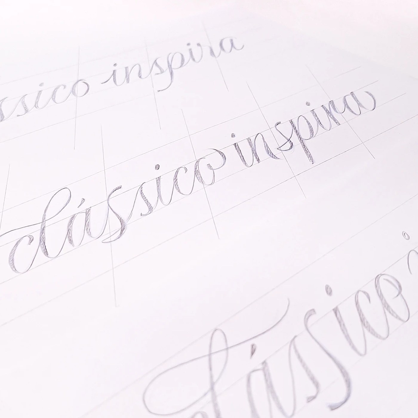
Abduzeedo: Plau engineered Reserva Script as a pointed-pen typography design system for Reserva, pairing Copperplate roots with sliced terminal cuts. Reserva established its market presence through a visual voic...
The article showcases a specific typography design that enhances brand identity, which is significant for the design industry, presents a somewhat novel approach by blending traditional and modern elements, and offers actionable insights for brand strategists.
Weekly digest
Get the Signal digest
Every Monday morning — the top 3 brand trends, 10 high-signal articles, and one emerging signal to watch.
No spam. Unsubscribe anytime.