Score
Stan Hema Rebrands Stadtmuseum Berlin As The Berlin Museum With A Wordmark Built From The City Itself
The rebranding of Stadtmuseum Berlin to the Berlin Museum emphasizes a more inclusive and flexible identity that resonates with the local community. By incorporating typography from various Berlin landmarks and everyday life, the new brand strategy aims to transform the museum's image from a traditional institution to a vibrant cultural hub that reflects the city's dynamic character.
Creative Boom: News Branding Stan Hema rebrands Stadtmuseum Berlin as the Berlin Museum, with a wordmark built from the city itself The Berlin studio has renamed the city's museum and given it a flexible identity that draws on typefaces from various local landmarks, U-Bahn stations, and even currywurst stands. Written By: Katy Cowan 6 August 2026 Imagine sitting on a collection of 4.5 million objects and discovering that most people in your own city can't tell you where you are. That was more or less the problem for Stadtmuseum Berlin, whose blunt feedback from locals was "Stadtmuseum Berlin?
Where is that?" It became the starting point for a full rebrand by Berlin studio Stan Hema. The biggest change is the name itself. Stadtmuseum Berlin and its various locations (including the Märkisches Museum and the Nikolaikirche) have adopted a single name: the Berlin Museum. "Berlin comes first for us, and our name reflects that now," explains Sophie Plagemann, its artistic director. It's a deliberate move to help the institution shake off the image of a "dusty history museum" toward a place for everyone. This approach started with the public. The museum ran an open call inviting Berliners to pick apart how the brand was seen.
Their collective thoughts shaped the entire brief: Berlin, in all its gritty, liberal glory, sits at the centre of the new identity. "Berlin challenges and fascinates. The Berlin Museum should feel like Berlin itself. Direct, a bit stubborn, and always open to people and new perspectives," says Lisa Geisler, brand strategist at Stan Hema. I recently visited Berlin for Pictoplasma. In between talks, I wandered the districts friends had recommended. Haus Schwarzenberg was a highlight. But I also loved Friedrichshain and Kreuzberg, despite seeing two grown men squat in a doorway in the same hour.
I think I came home and described it as "slightly feral and unhinged in the best possible way". And anyone who's been will probably agree. There's nowhere like it, so what do you do with it? Well, in this case, you stop trying to force it into one tidy logo. Because it just wouldn't be Berlin. So instead of a single fixed mark, the Berlin Museum now has a flexible wordmark where typefaces shift and combine. The twist is that those typefaces come straight off the street. "For us, the wordmark is the identity-defining element of the museum.
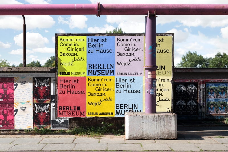
It is directly connected to the reality of our city," explains André van Rueth, designer and typographer at Stan Hema. "To achieve this, we gathered typography from everyday Berlin: from U-Bahn stations and iconic buildings to the local currywurst stand. From this mix, we created a logotype system that brings different Berlin typefaces and perspectives into dialogue." The result, seen across a run of posters for the museum's sites, is a 'Berlin Museum' lockup where the letters don't quite match, set in bold coral, lime, and sky blue, and punctuated by a little arrow made of tiny crosses. It shouldn't work, but it does.
Which is what Berlin is really about. For a traditional institution, it's a genuinely brave move. They've created something based on what Berliners think of the museum rather than having the board decide behind closed doors. "The new Berlin Museum brand is a warm invitation to everyone who lives in and visits Berlin," says Mathias Illgen, managing director at Stan Hema.
Article truncated for readability. Read the full piece →
The rebranding of a significant cultural institution like Stadtmuseum Berlin to the Berlin Museum represents a noteworthy shift in how museums can engage with their communities, making it impactful and relevant for brand strategy professionals, while the unique use of local typography adds an element of novelty.