Score
Kanaisasaki Is Formed From In House Designers Who Have Made A Career Out Of Staying Curious
Kanaisasaki, formed by in-house designers Aki Kanai and Taku Sasaki, has undertaken a full redesign of the corporate identity for Kokuyo, a Japanese stationery giant where they have worked for 17 years. Their approach emphasizes curiosity and collaboration, aiming to create designs that integrate seamlessly into daily life while maintaining a flexible visual identity system. Brand strategists can learn from their model of balancing in-house and independent work to foster innovation and adaptability in brand identity development.
Creative Boom: Kanaisasaki is formed from in-house designers who have made a career out of staying curious Aki Kanai and Taku Sasaki have worked at the same Japanese stationery giant for 17 years – balancing their corporate work with an independent practice spanning identity, products, exhibitions and experimental materials. For most designers, the dream project is an identity for a company they love. Aki Kanai and Taku Sasaki, working together as Kanaisasaki, got to do it for the one that employs them.
After 17 years at Kokuyo, the Japanese maker of stationery and office furniture, the pair announced a full redesign of its corporate identity at the end of last year. "We are very proud to have taken on this project ourselves," they say. Both grew up in Tokyo; Sasaki studied product design at Tama Art University, and Kanai studied graphic design at Tokyo University of the Arts. They joined Kokuyo at the same time, started talking about design during their shifts, and eventually began collaborating as a team of two art directors.
Their work for the company drew attention and, after both won the JAGDA New Designer Award, commissions started flooding in. They now split their time between Kokuyo and other clients, and they see that as a model in itself: "by maintaining an independent approach to our work despite being in-house designers, we've come to believe there may be new models for design organisations and career paths." As a manufacturer, Kokuyo also shapes what they make.
"We're exploring forms of graphic design that people want to own – designs that become part of their daily lives – rather than advertisements meant to convey information in an instant." Working across different fields, they're put in front of unfamiliar ideas regularly, and inspiration can come from many different corners. They "cherish those moments when we encounter things we didn't know before", and they make sure to pay attention to small discoveries in daily life, too, "being mindful not to overlook them". After this, they get their heads down in the work. One of them starts something, and then both look at it together and chat.
Then, the other refines it, and they swap files back and forth until it's done. "We place great importance on working together as a pair to step away from our individual perspectives and maintain objectivity." The number of handovers, of course, depends on the job. Tight deadlines mean more exchanges, and big, long projects mean many more. They also always have client and personal projects running side by side, because "the accumulated experience from both types of work positively influences each other". The Kokuyo identity is an apt example of this.
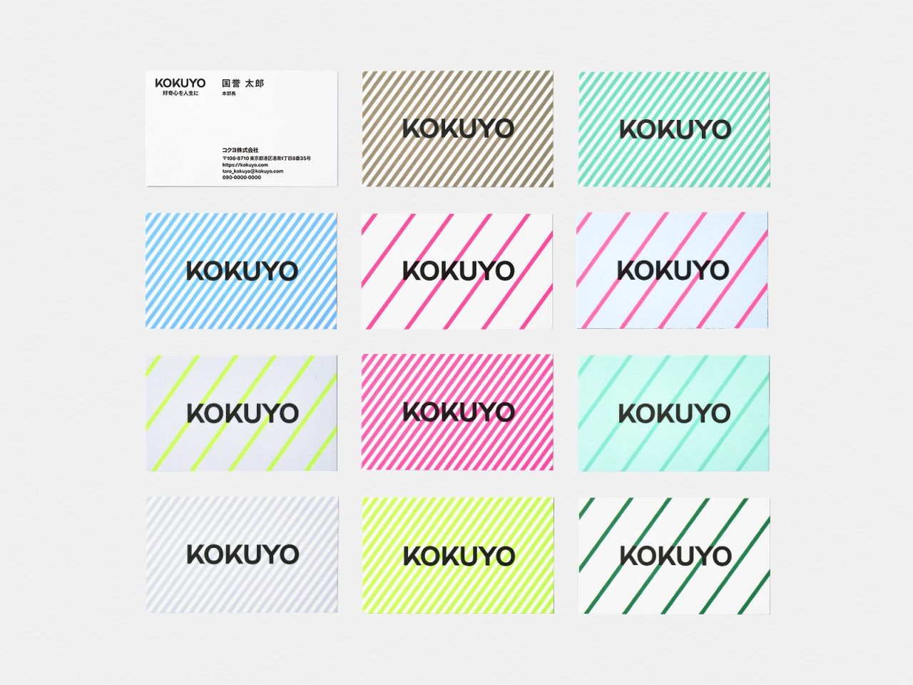
The logo is a bold black wordmark, which appears over diagonal blue stripes, repeated in a black-on-blue pattern and turned mint green. The same look is on the grey building's sign, on paper shopping bags in mint and pink, pale green and blue envelopes, a grid of business cards in different stripe colours, plus green, blue and black caps. The hand-shaped mug even wears the same pattern, showing how the designers have made a kit of some sort. "We are building a system that generates a wide range of designs based on simple yet flexible rules," they explain.
Article truncated for readability. Read the full piece →
The article discusses a significant rebranding effort by in-house designers for a well-known company, offering insights into innovative design practices that are relevant to brand strategists.
Weekly digest
Get the Signal digest
Every Monday morning — the top 3 brand trends, 10 high-signal articles, and one emerging signal to watch.
No spam. Unsubscribe anytime.