Score
Café 170º Coffee Packaging by M+C SAATCHI
Café 170º's packaging strategy emphasizes precision and clarity, using the specific temperature at which coffee beans transform as a foundational design element. This approach not only creates a cohesive brand identity but also ensures that every touchpoint, from packaging to in-store signage, reinforces the brand's narrative of sophistication and intentionality. For brand strategy, this highlights the importance of a unified design system that communicates core values effectively across various formats.
Abduzeedo: Café 170º Coffee Packaging by M+C SAATCHI abduzeedo March 29, 2026 M+C SAATCHI Spain designed the coffee packaging for Café 170º, building an entire brand system around the exact temperature at which beans transform In a market full of origin stories and craft narratives, Café 170º takes a different path. Created by M+C SAATCHI Spain for Mahou San Miguel, the brand draws its name and identity from a single technical detail: 170 degrees marks the temperature at which coffee beans begin to release their true character. That precise moment becomes the foundation for every design decision in the coffee packaging system.
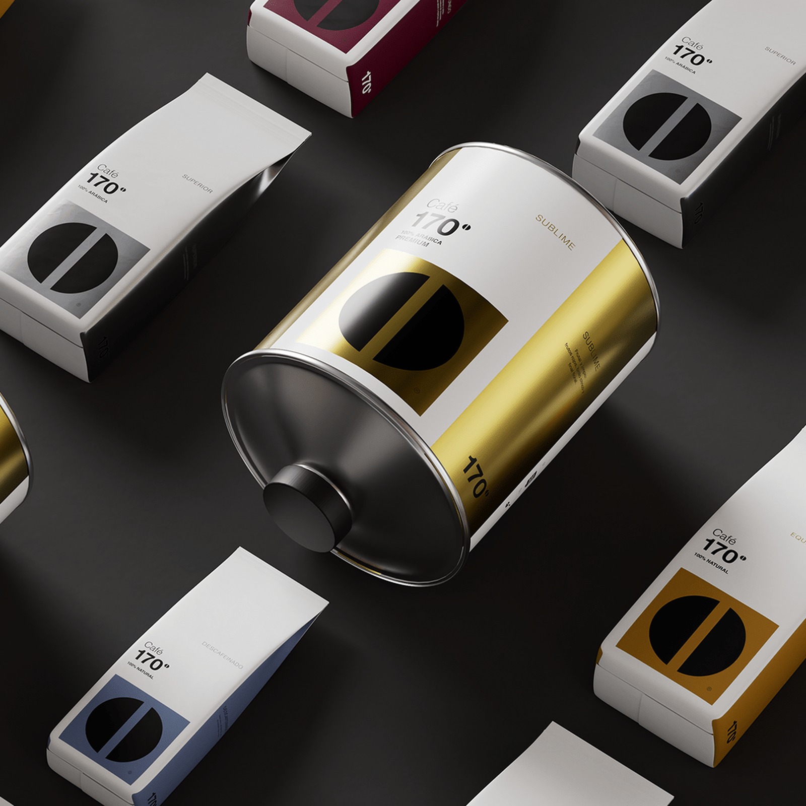
Coffee Packaging Built on Precision The 170º mark serves as the central visual asset across the coffee packaging. It functions not as decoration but as a structural device that organizes layout, defines hierarchy, and ensures recognition across formats. The design strips away unnecessary elements to focus on clarity and impact. A black and white foundation, supported by controlled color accents and subtle metallic finishes, creates a sense of sophistication without excess. Typography acts as a tool for clarity rather than expression. Every element feels measured and intentional.
The logo system uses the degree symbol as a core graphic element, turning what could be a simple typographic detail into the visual anchor of the entire coffee packaging range. The system scales across coffee bags, takeaway cups, cans, porcelain cups, plates, and in-store signage. Each application maintains the same visual logic. Rather than designing isolated pieces, M+C SAATCHI created a unified system where every touchpoint reinforces the next. The coffee packaging works equally well in hospitality environments and retail contexts.
Creative direction came from Alejandro de Antonio and Manu Gómez at M+C SAATCHI, with art direction by Marta Villa González and 3D work by Sergio Ruiz Cáceres. The project was led by CEO and Executive Creative Director Andrés Martínez.
The article discusses a unique approach to packaging that enhances brand identity, making it significant for the industry while providing actionable insights for brand strategy professionals.