Score
The hidden meaning behind the new Brisbane Olympics logo
The article discusses the newly unveiled logo for the 2032 Olympic Games in Brisbane, Australia, which incorporates various symbolic elements, including references to local wildlife and the year of the Games. The design aims to reflect the unique character of Brisbane while also embracing vibrant colors similar to those used in the branding for the 2028 Los Angeles Games. Brand strategists can learn from this approach to infuse deeper meanings into visual identities, enhancing connection with local culture and audiences.
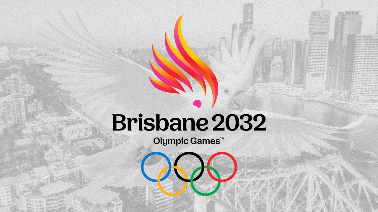
FastCompany: The emblem for the 2032 Olympic Games in Brisbane, Australia, is updating a well-known Olympic and Paralympic symbol to give it new meaning. Organizers accidentally leaked their own branding after inadvertently posting a video explaining the 2032 Games’ logo to its YouTube page. The emblem consists of shapes suggesting a five-flame Olympic torch and referencing several other meanings, chiefly the crest of a cockatoo and the location and year of the Games.
[Images: Brisbane 2032, Eric Isselée/Adobe Stock] Brisbane organizers introduced the emblems in a promotional video by explaining that they chose to depict a cockatoo, a bird native to the region, because of its cheeky, playful spirit and the fact that it’s “iconically Australian” and significant to First Nations. [Images: Brisbane 2032, Ryan/Adobe Stock] Designers snuck in other details, too. The five feathers in the crest are grouped in bunches of three and two, to stand for ’32, the year the Games will be held, and the crest is shaped to fit inside the map of Queensland, the Australian state of which Brisbane is the capital.
[Images: Brisbane 2032, magr80/Adobe Stock] The emblem comes in two colorways, pink with orange accents to represent the pink cockatoo for the Olympics, and yellow to pink to represent the sulphur-crested cockatoo for the Paralympics. The Games will be the third held in Australia after Melbourne in 1956 and Sydney in 2000.
Andrew Liveris, president of Brisbane 2032, said in a statement that Olympic and Paralympic Games emblems are “an opportunity to promote the unique character” of a specific Games, so for Brisbane, “multiple elements have been subtly woven together.” The identity was designed by a consortium announced last year that includes the VML and Landor agencies, the social research firm Kantar Public, and BlackCard, a First Nations consultancy. Still to come is a mascot reveal. The Brisbane Games’ use of vivid colors follows in the footsteps of the vibrant branding for the 2028 Los Angeles Games unveiled earlier this year.
Inspired by the California superbloom, an occasional, massive bloom of desert wildflowers, and the bird of paradise, the official flower of L.A., the L.A. Games color palette proved Olympic branding can embrace bright color. Now Brisbane is doing the same. Modern Olympic visual identities are released years ahead of the actual Games. A logo for the Utah 2034 Games , for example, was unveiled late last year, nine years before they’ll be held, while the mark for the 2030 Games in the French Alps came out this past June.
That lag time presents a challenge for designers who must make their work hold up for years without knowing what future design trends might come. A mark that looks fresh and forward today might look dated in nearly a decade’s time. Local people who spoke to the Australian Broadcasting Corporation like the new design for Brisbane. “I love the hidden messages of it,” Arisa Trew, a gold medalist skateboarder, said at a press conference for its unveiling.
Article truncated for readability. Read the full piece →
The article discusses a significant event in branding with the unveiling of a major logo for the Olympics, which has implications for brand strategy professionals in terms of cultural relevance and identity.
Weekly digest
Get the Signal digest
Every Monday morning — the top 3 brand trends, 10 high-signal articles, and one emerging signal to watch.
No spam. Unsubscribe anytime.